Conceptual color development
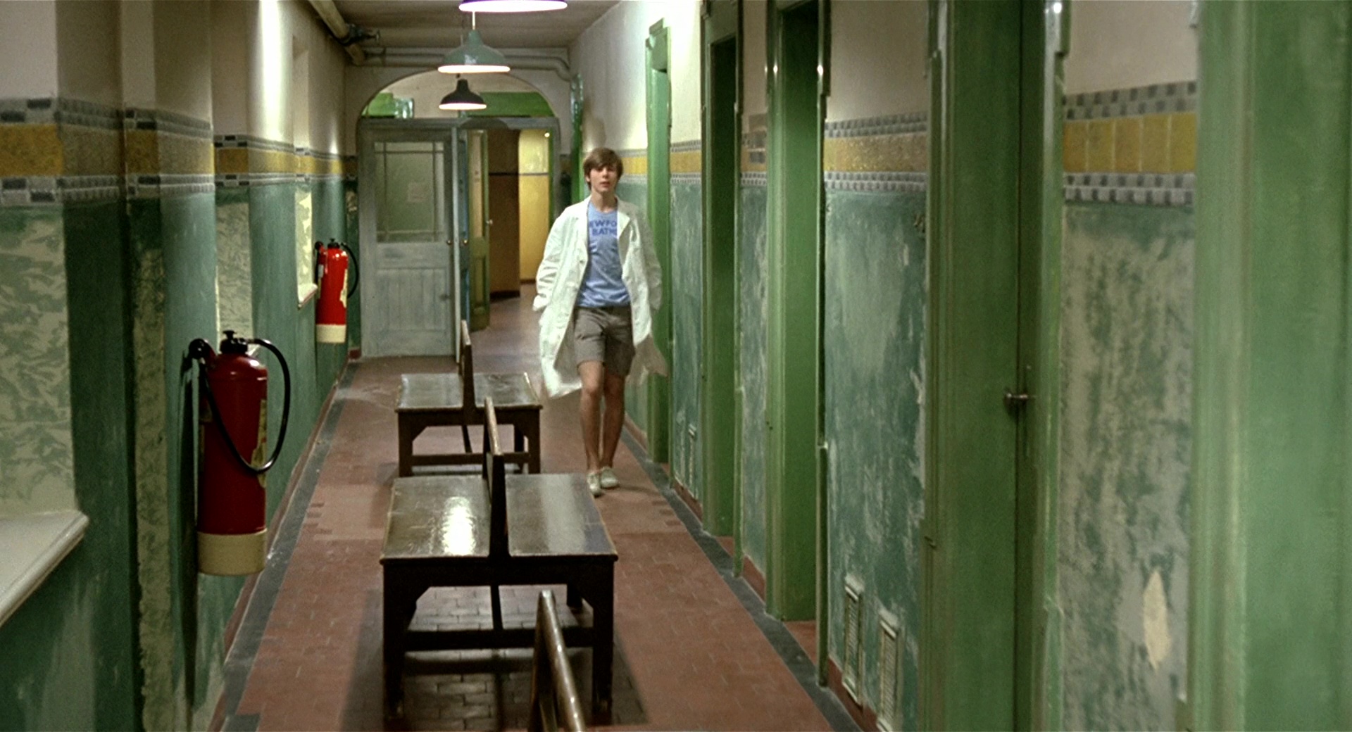
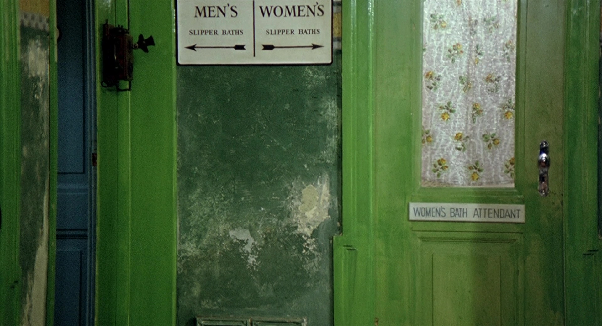
'There's never been a colour movie I've freaked out over except one: this thing called Deep End' – David Lynch The film Deep End (1970) introduces us to the life of young Michael (John Moulder-Brown) just as he begins to work in the Newford public baths. There he meets his partner Susan (Jane Asher) to whom he feels attracted and will end up becoming obsessed with her rejection. The film is about dealing with sexuality and intimate relationships that took place in the Swinging London, between mid-60s and early 70s, due to the sexual revolution that happened with the introduction of the contraceptive pill in 1964. Taking advantage of the social context and the chromatic explosion of the time, Jerzy Skolimowski uses the screen as if it was a canvas. Through the use of color, he manages to define the characters and the interactions that take place between them, expressing ideas and concepts in a purely visual way.
All excerpts from Deep End BFI Blu-ray edition © 2011 British Film Institute. All rights reserved.
Spoiler Alert: Crucial plot points are revealed in the interest of the analysis.
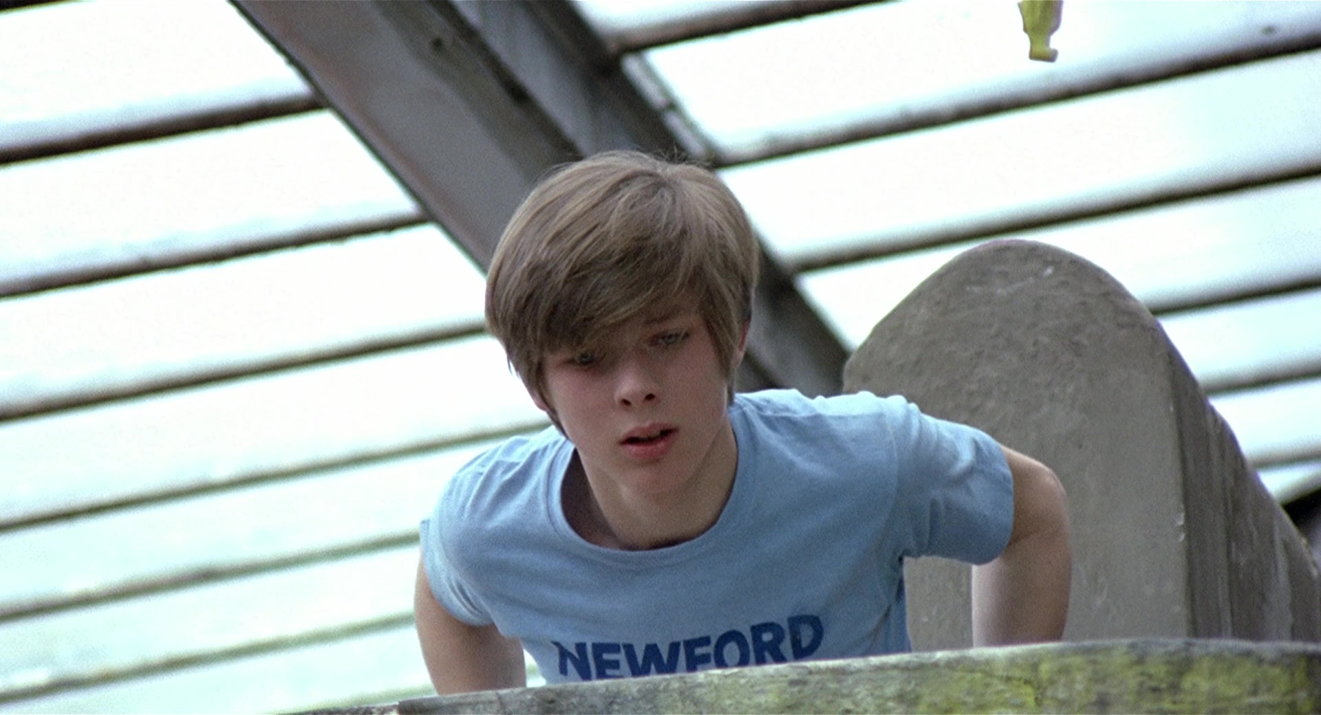
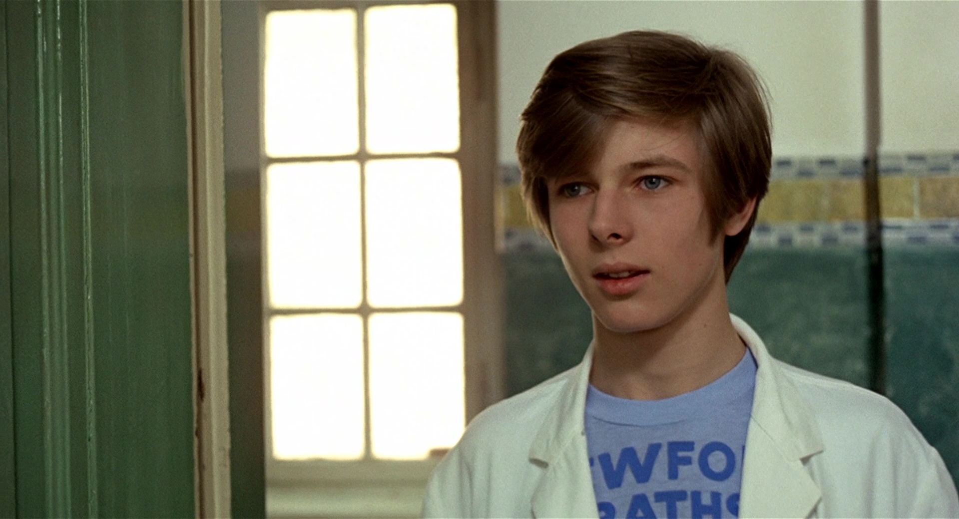
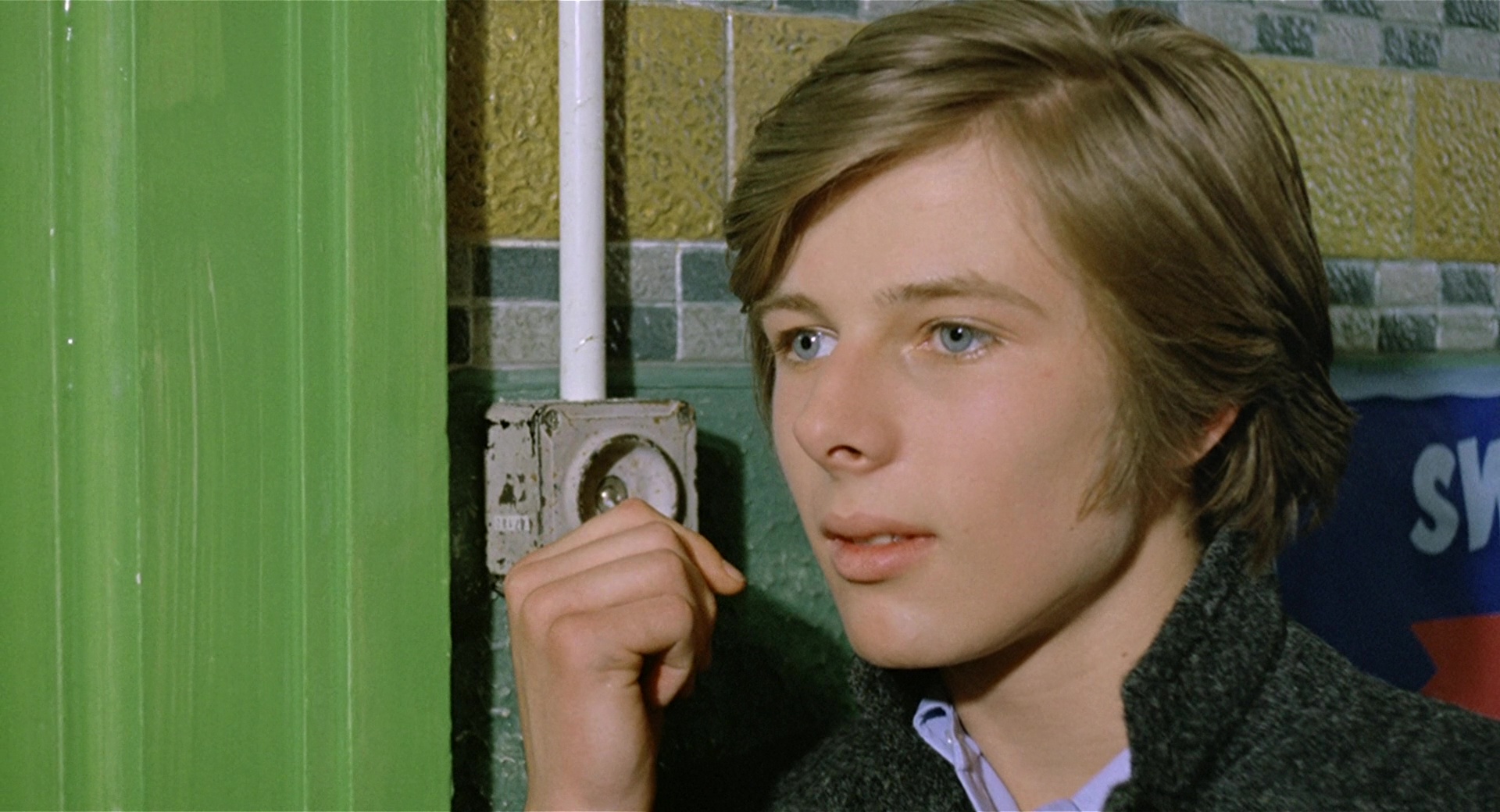
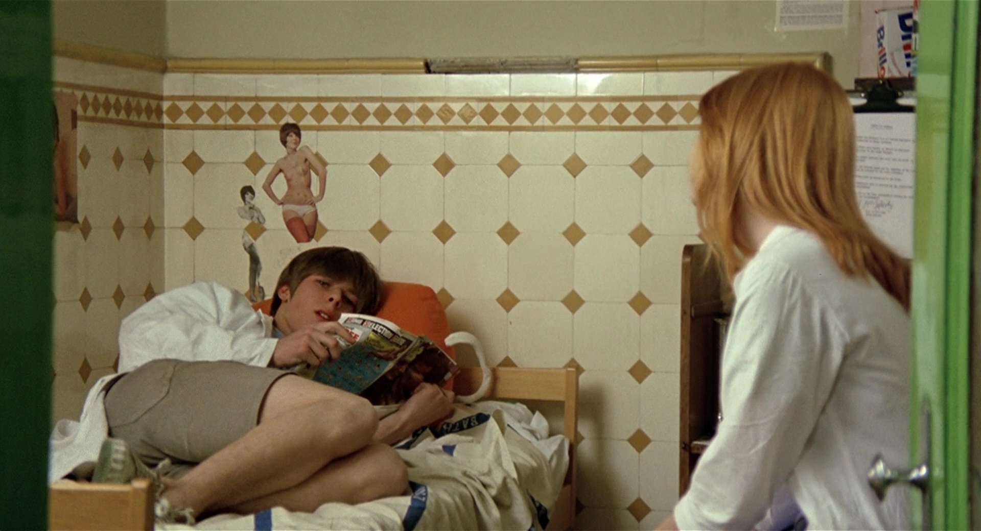
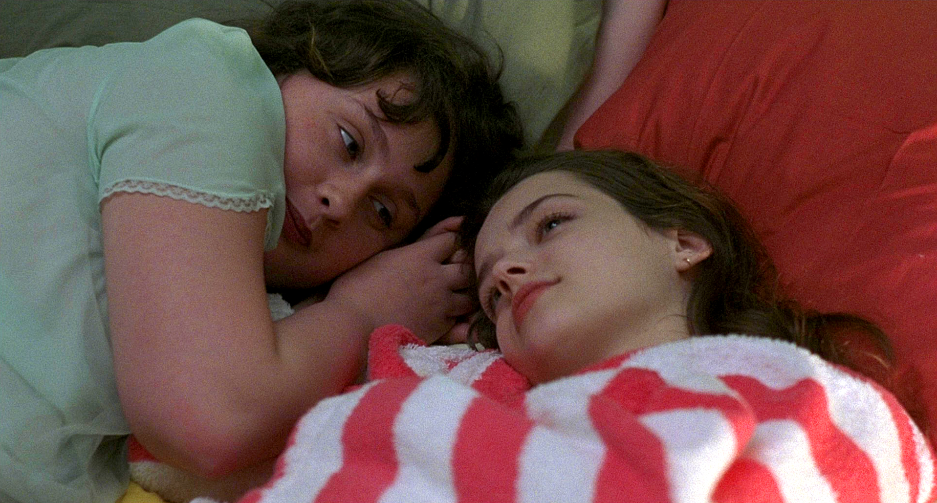
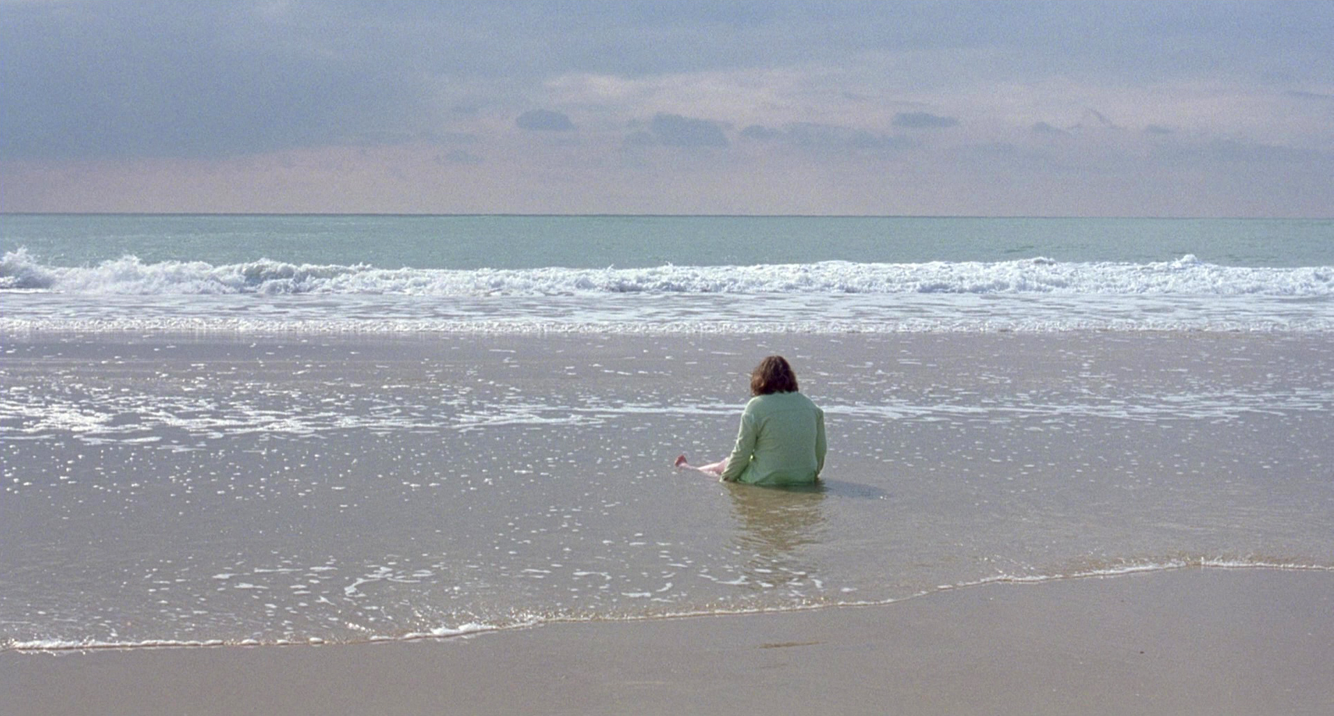
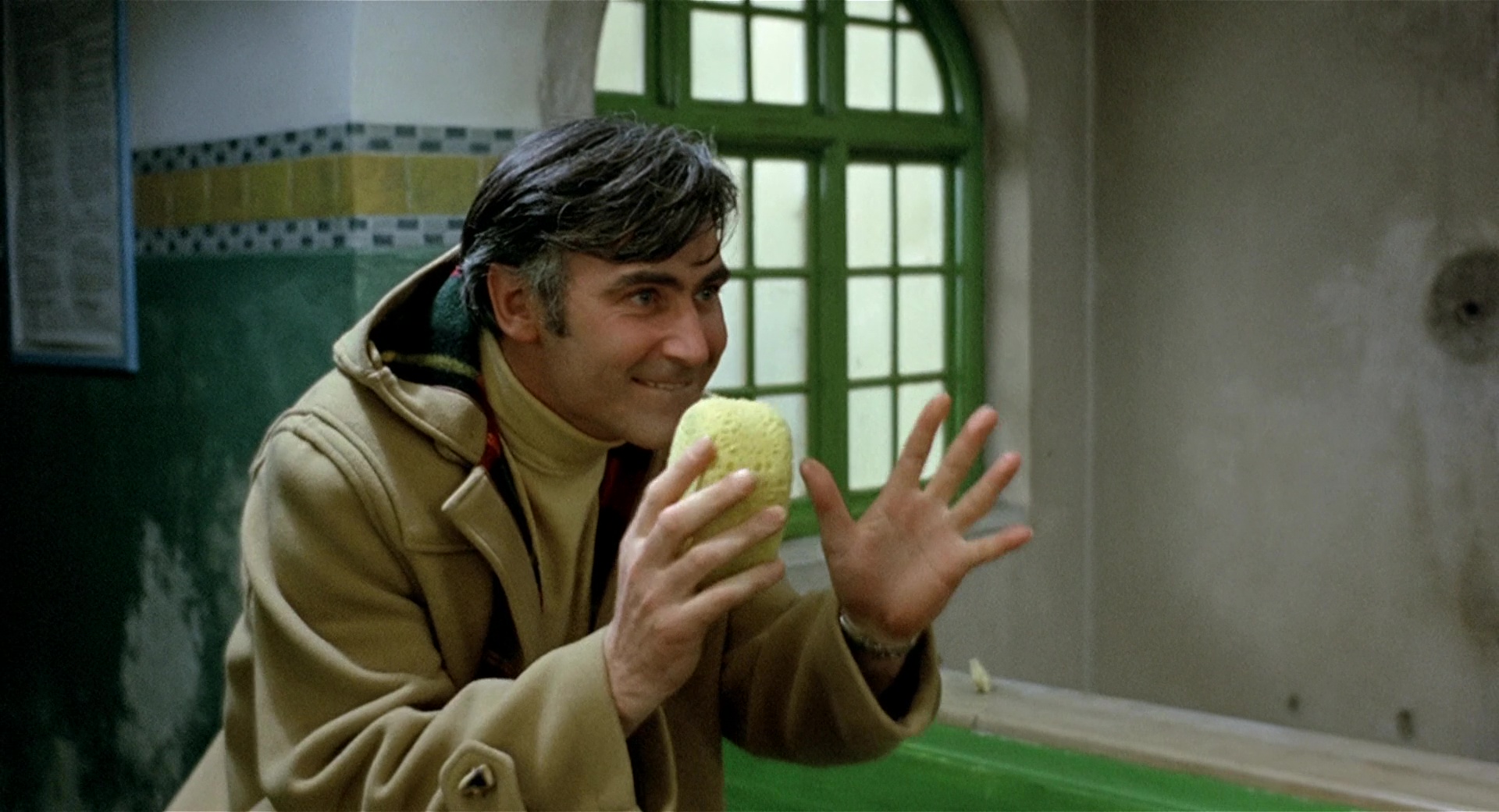
1. Michael – Blue
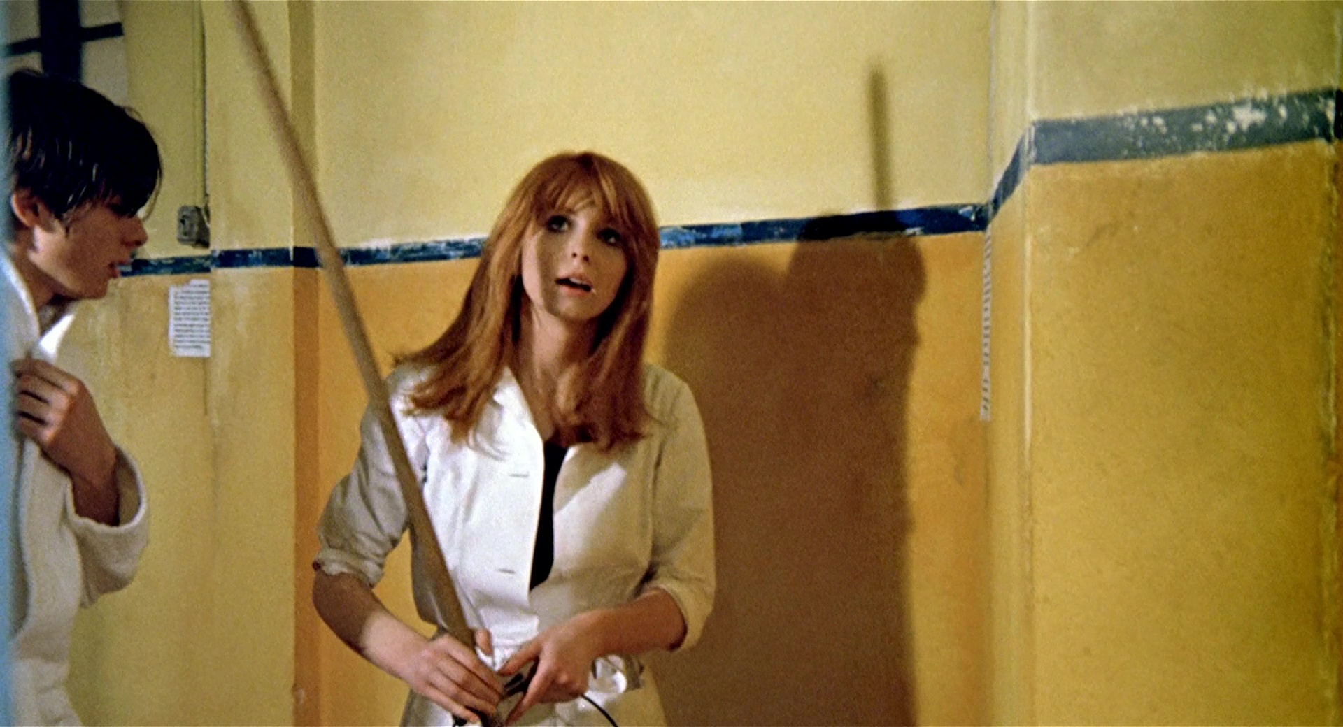
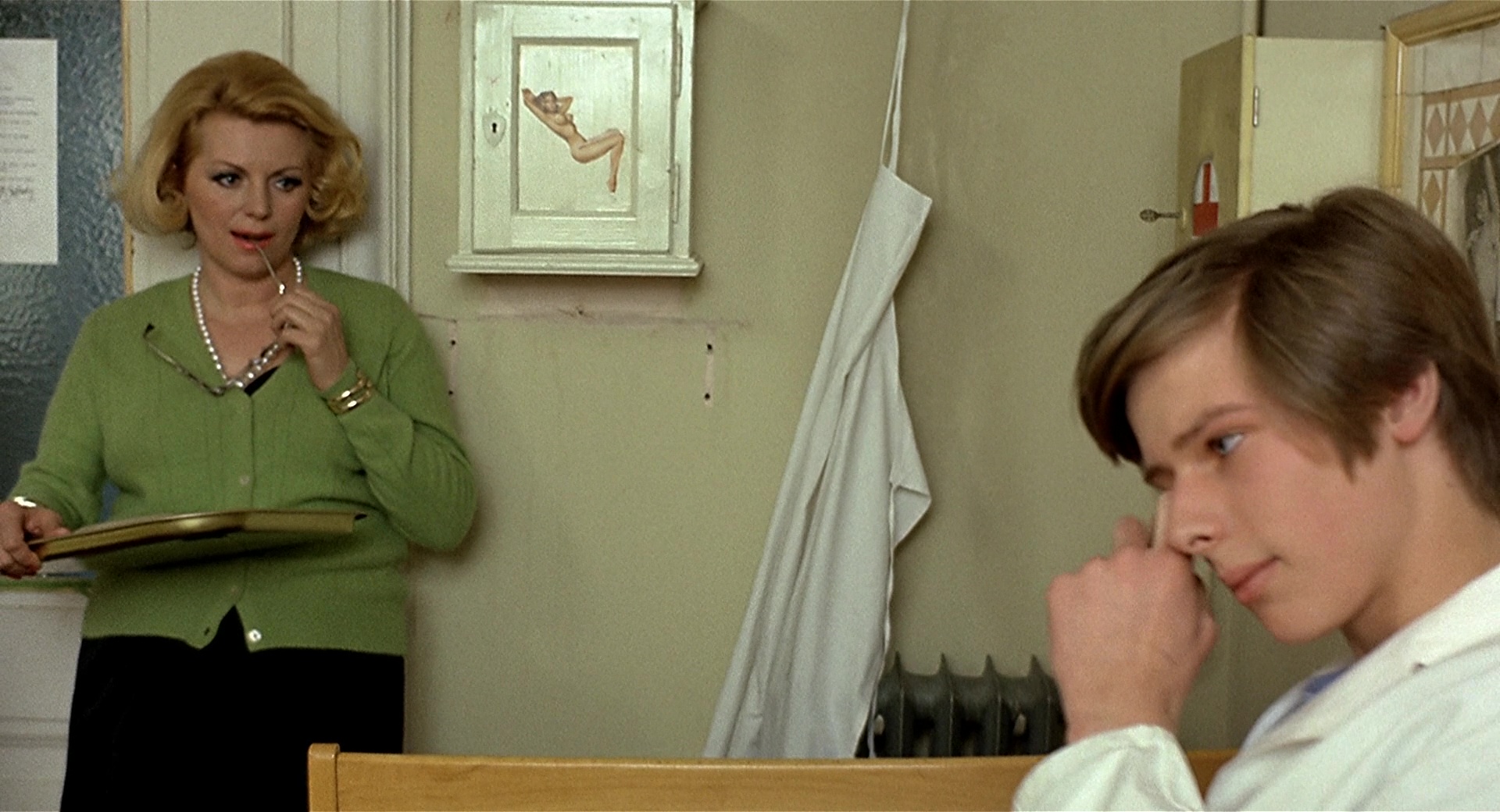
The narration of the story is established from Michael’s point of view, who is the protagonist of the film, and is characterized through BLUE color.The concepts that orbit around the chromatic range of BLUES are the attributes that any teenager entering adulthood can have: inexperience, introversion, recklessness or vulnerability.BLUE is the pivot point on which the other colors/characters will interact.
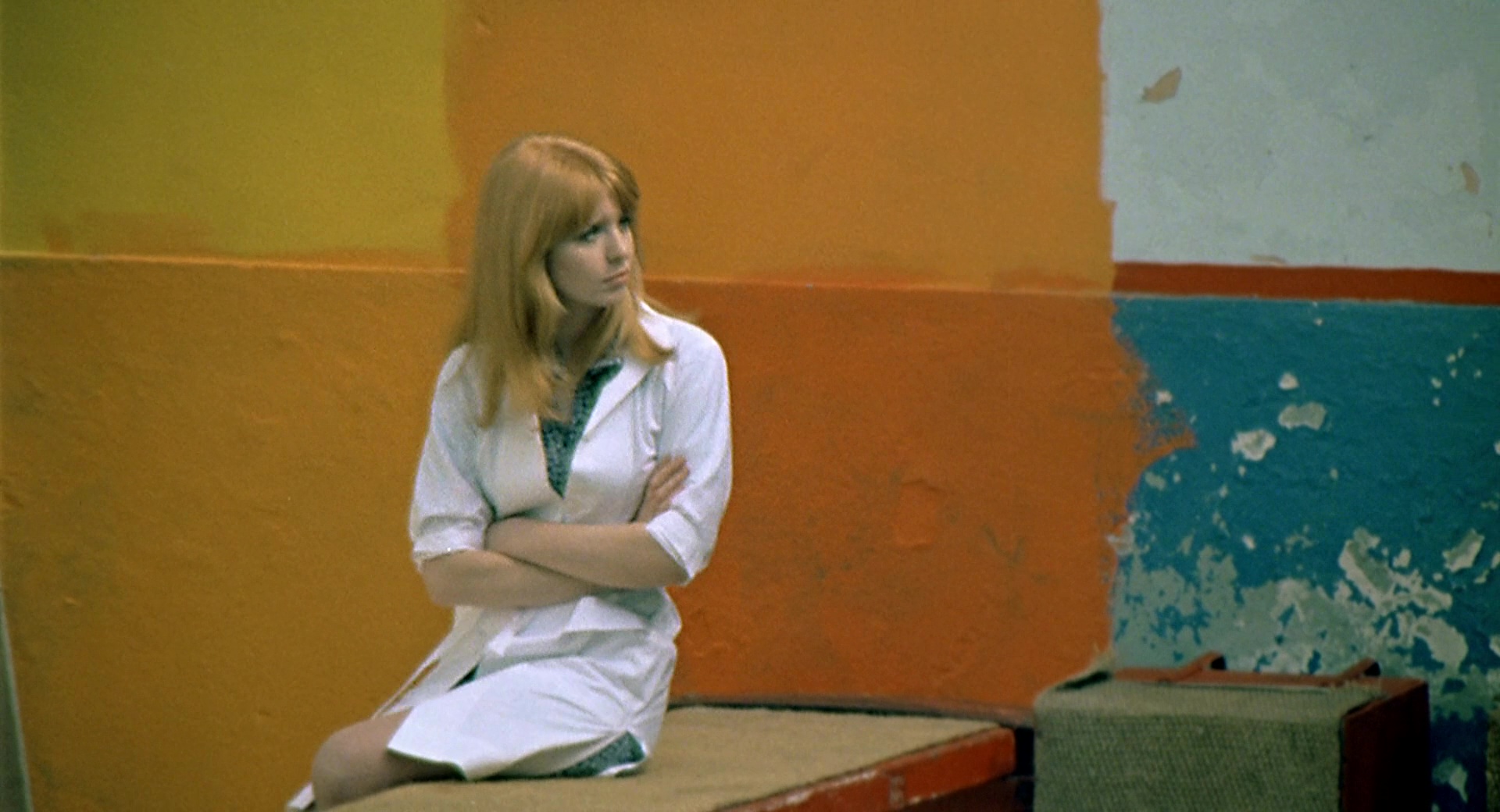
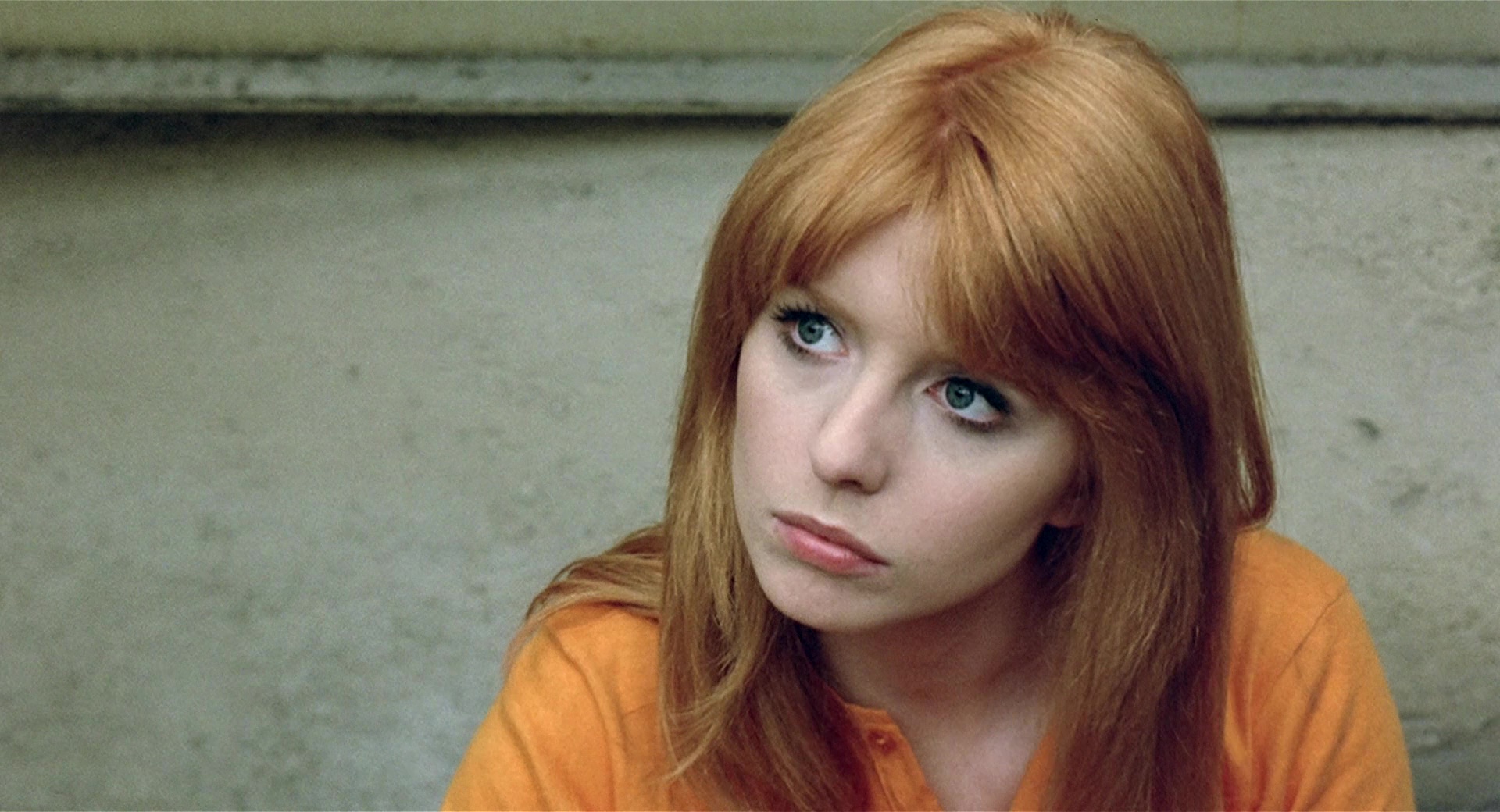
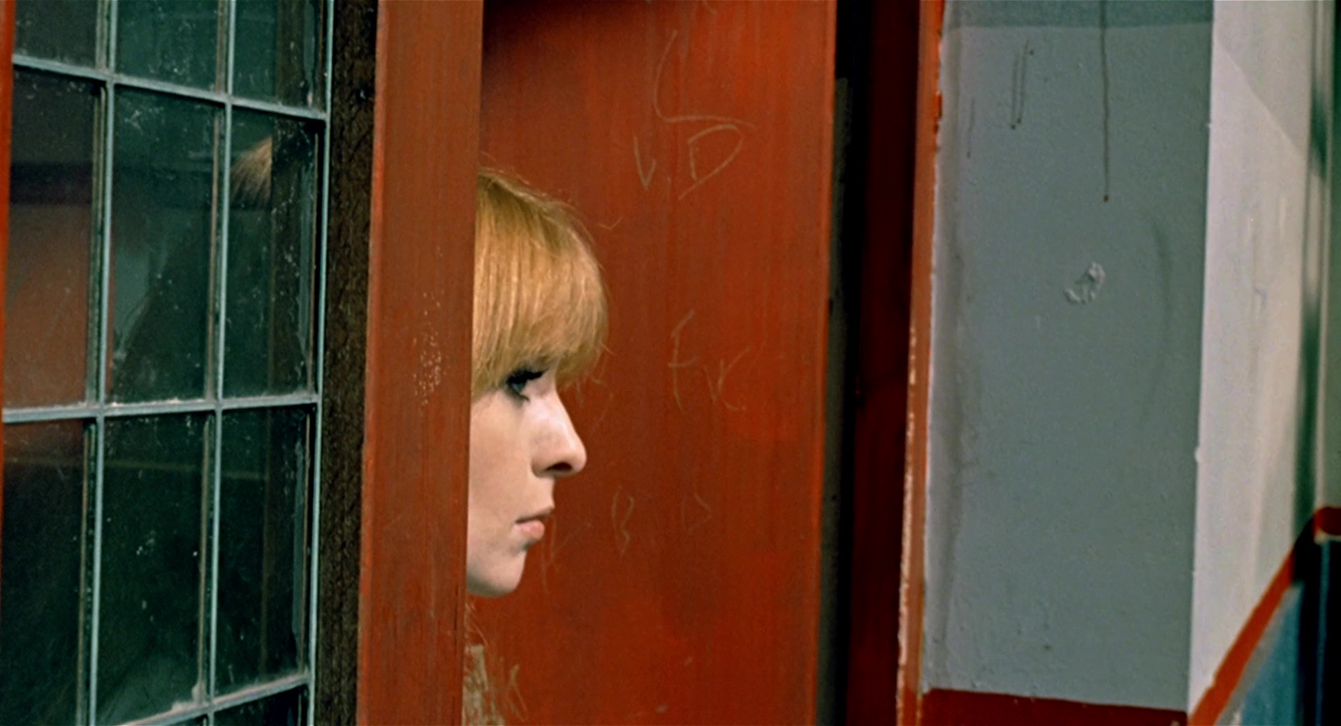
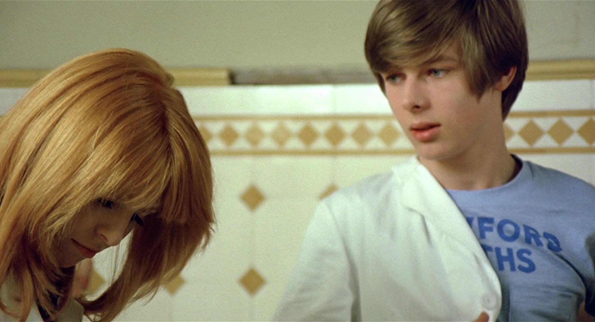
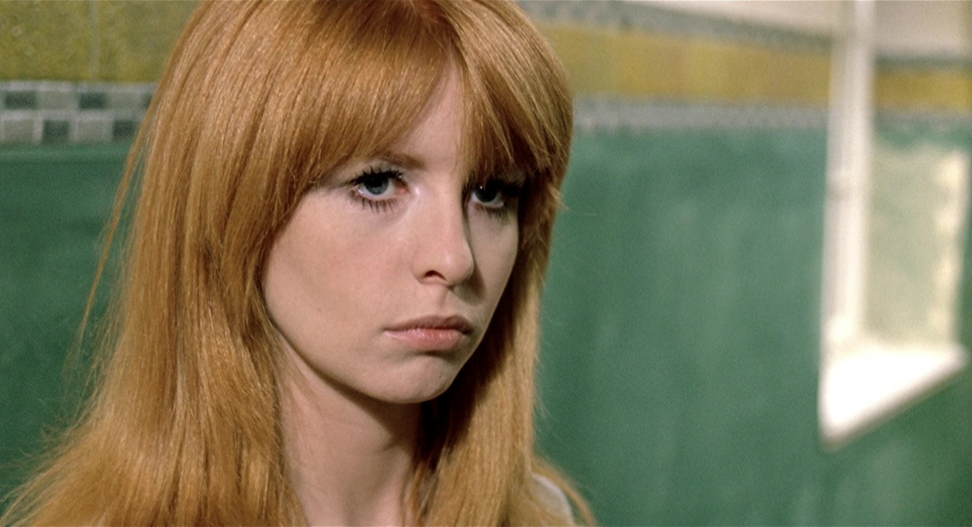
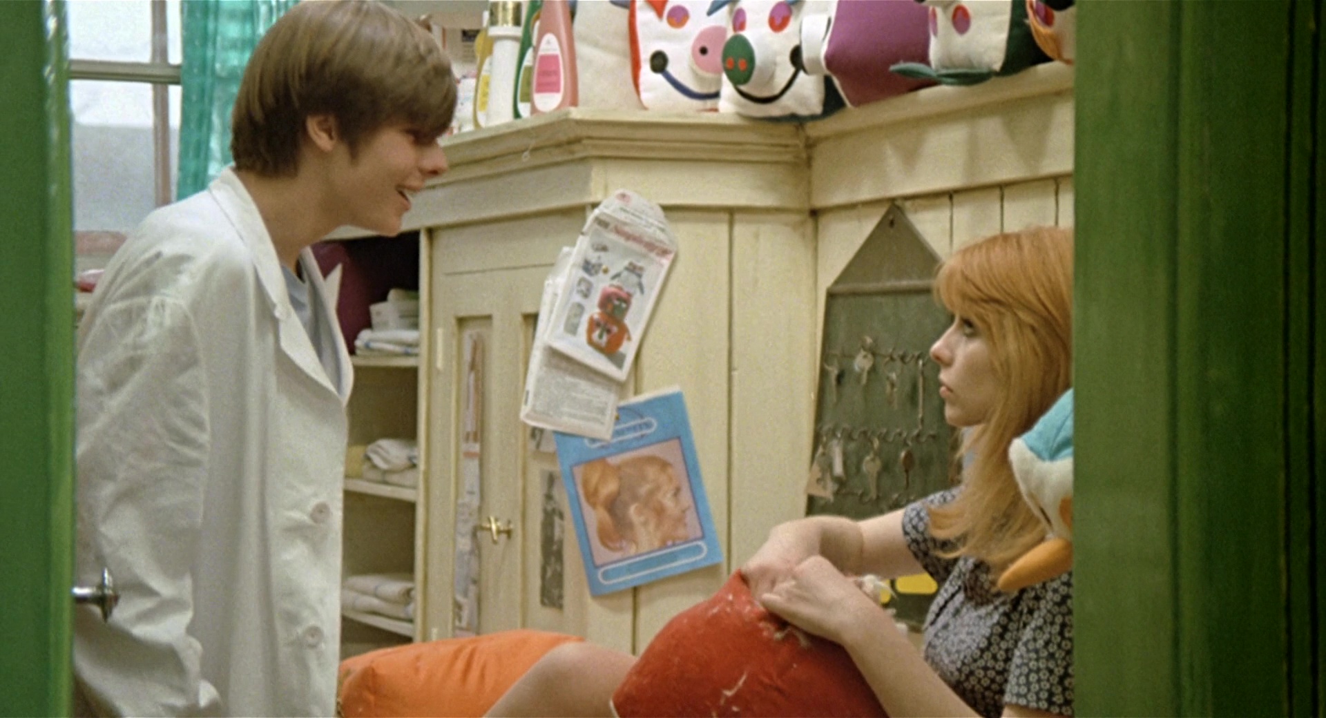
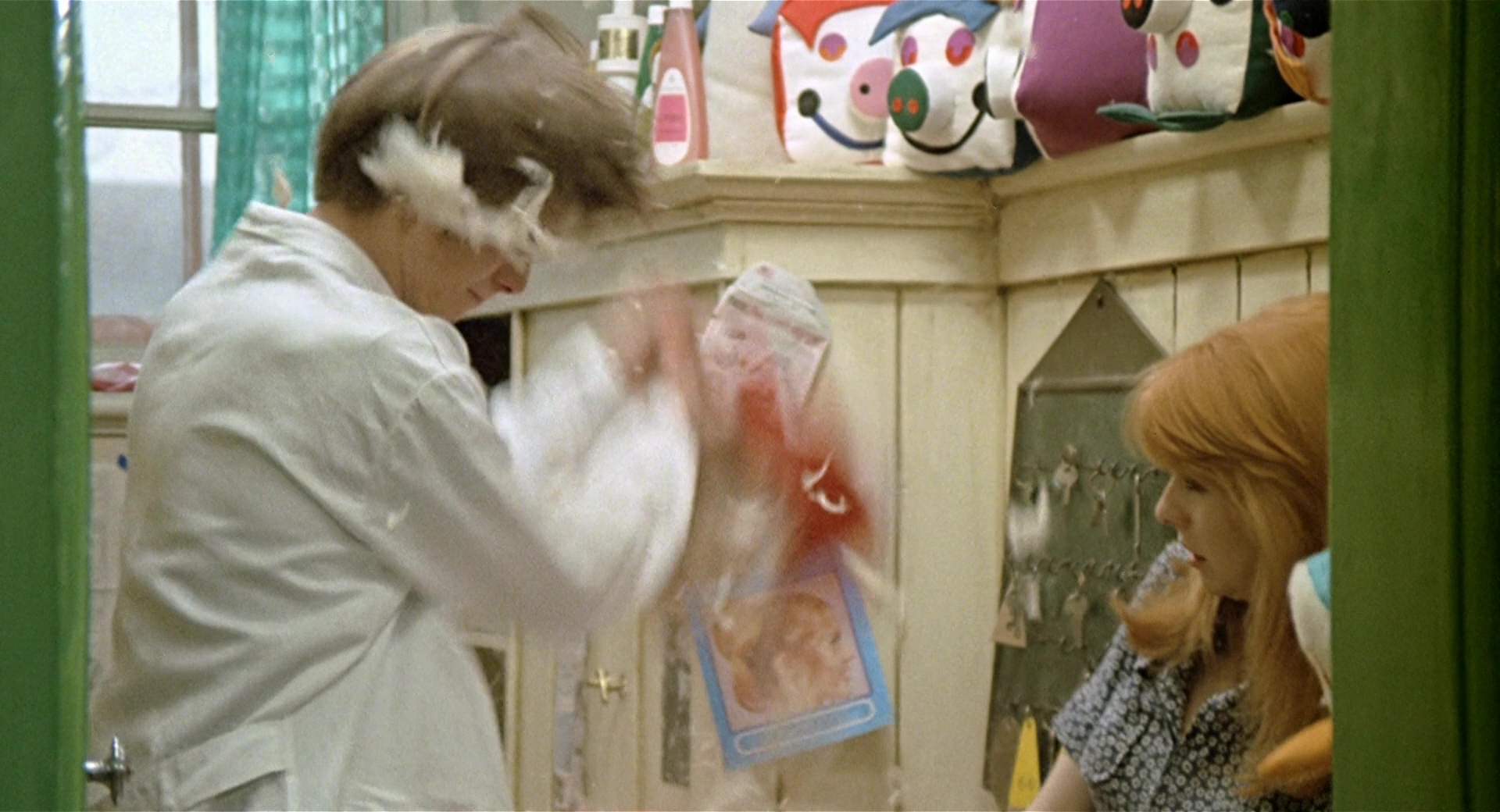
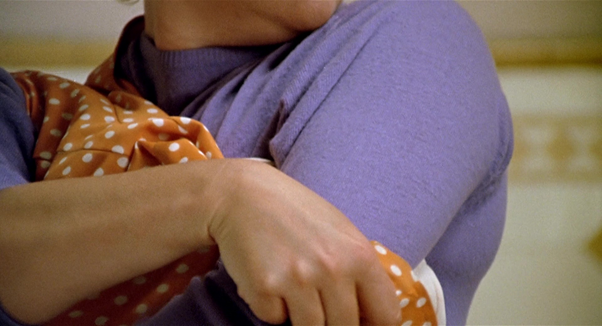
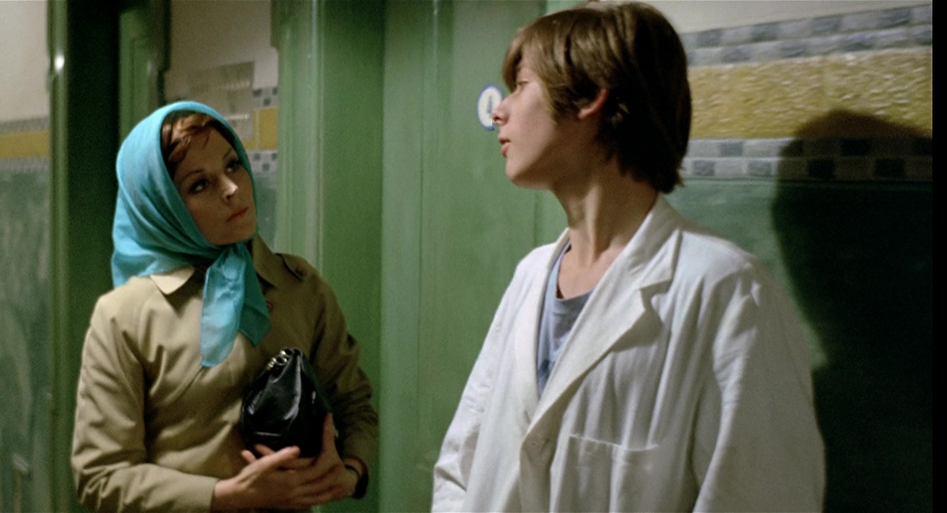
2. Susan – Orange
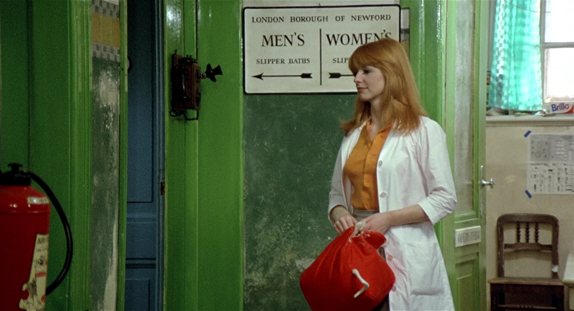
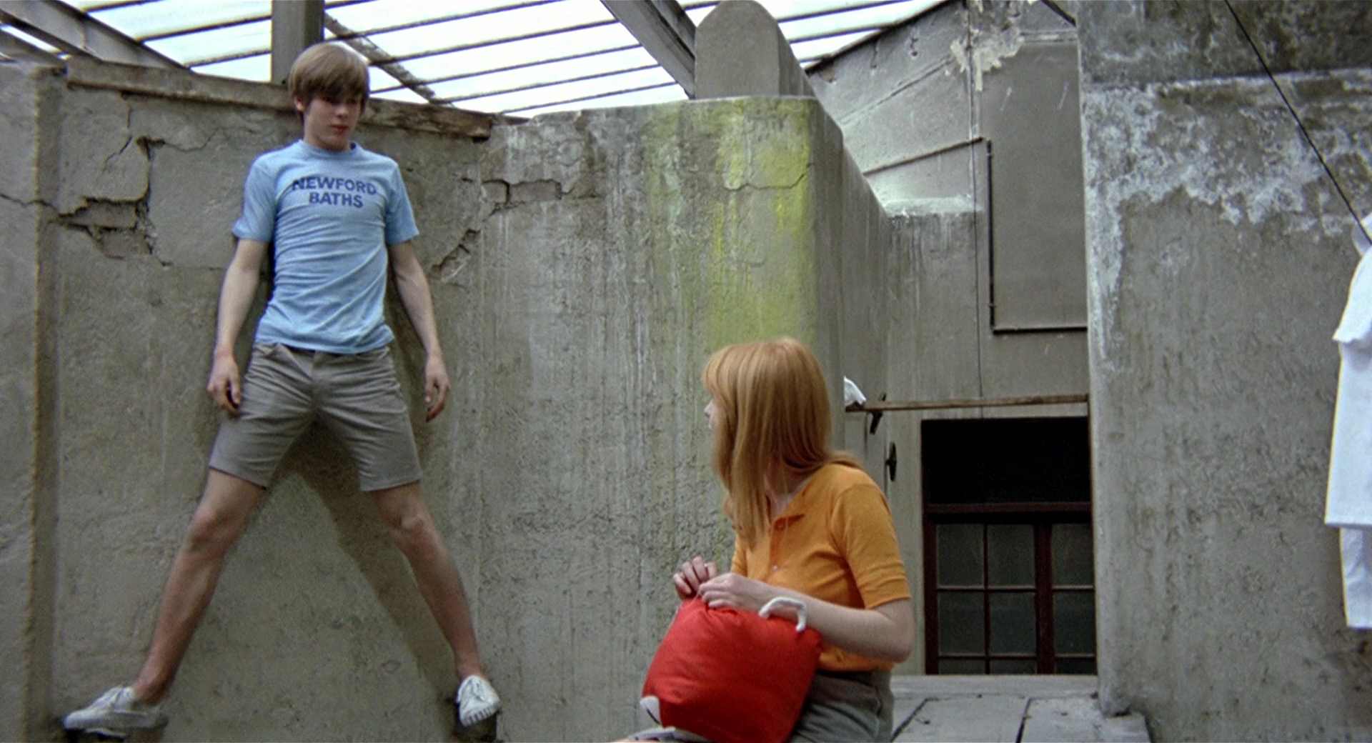
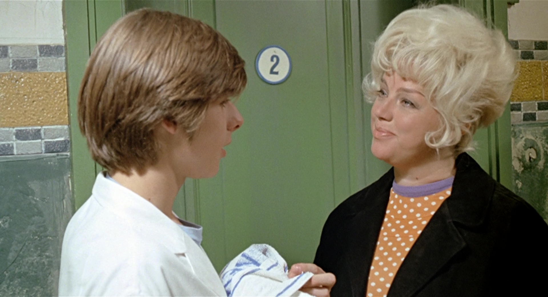
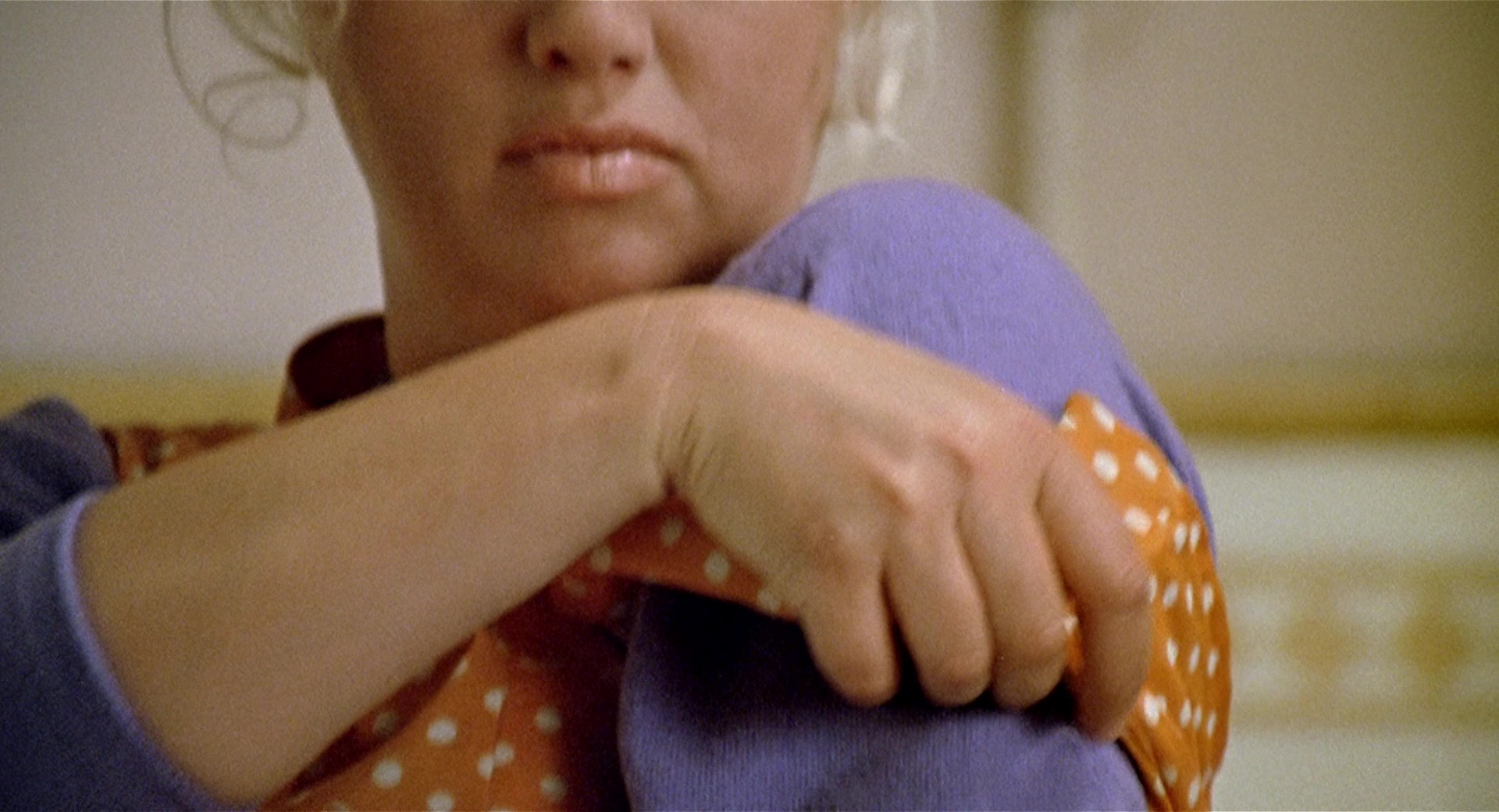
Susan, Michael’s coworker in the Newford Baths is characterized through ORANGE.The concepts linked to ORANGE colors are referred to femininity.From Michael’s point of view, Susan represents the female gender. For this reason, most of the women who appear in the film also wear orange.
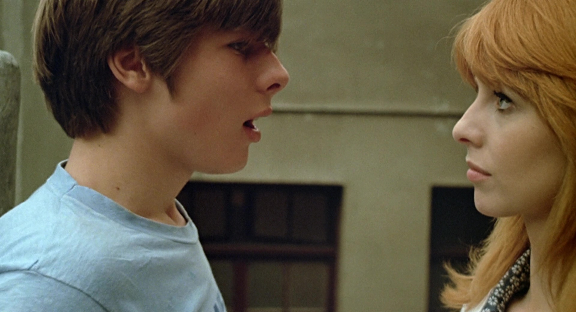
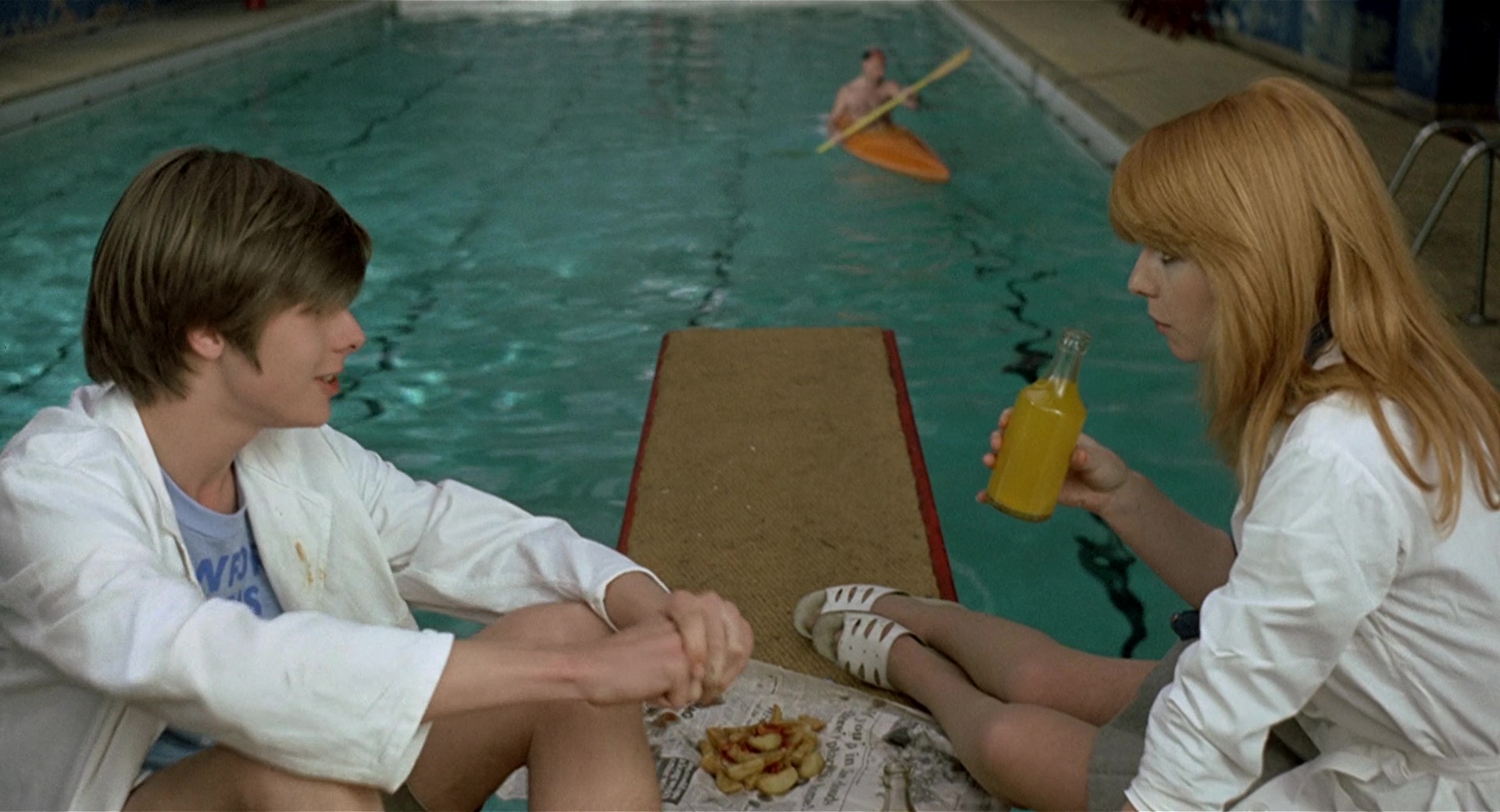
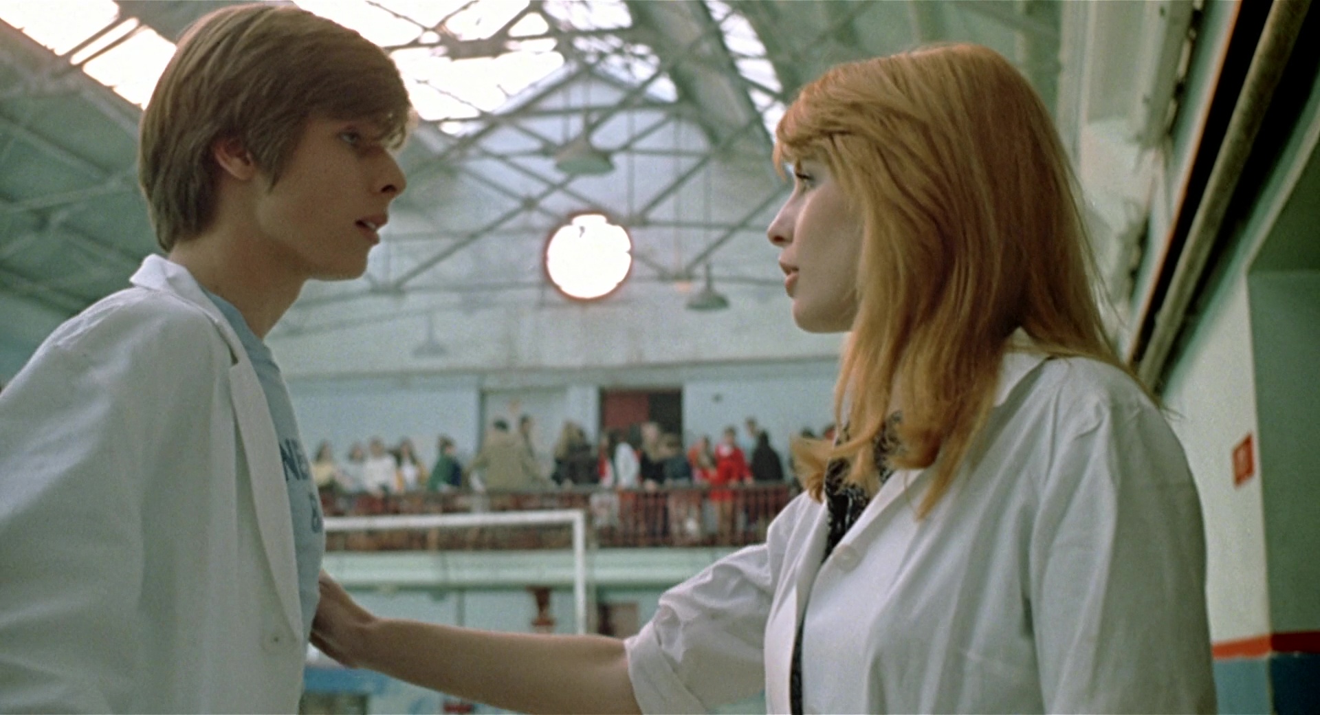
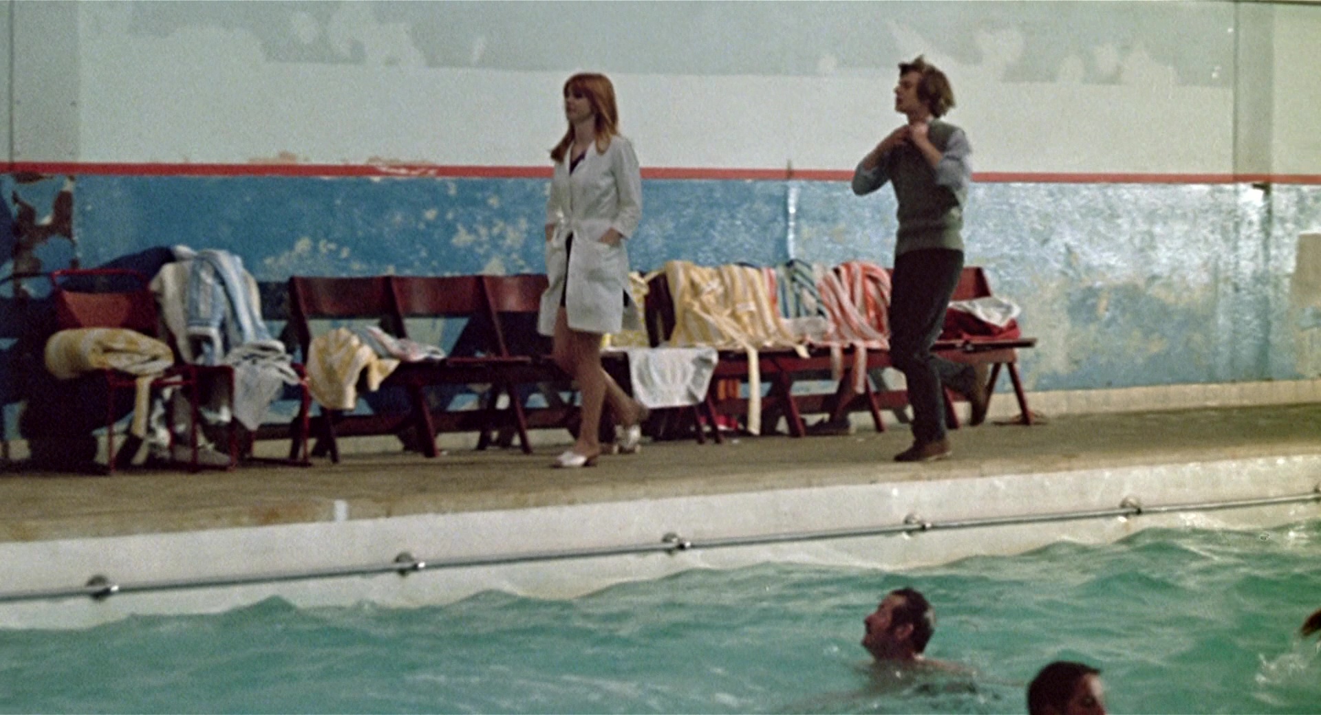
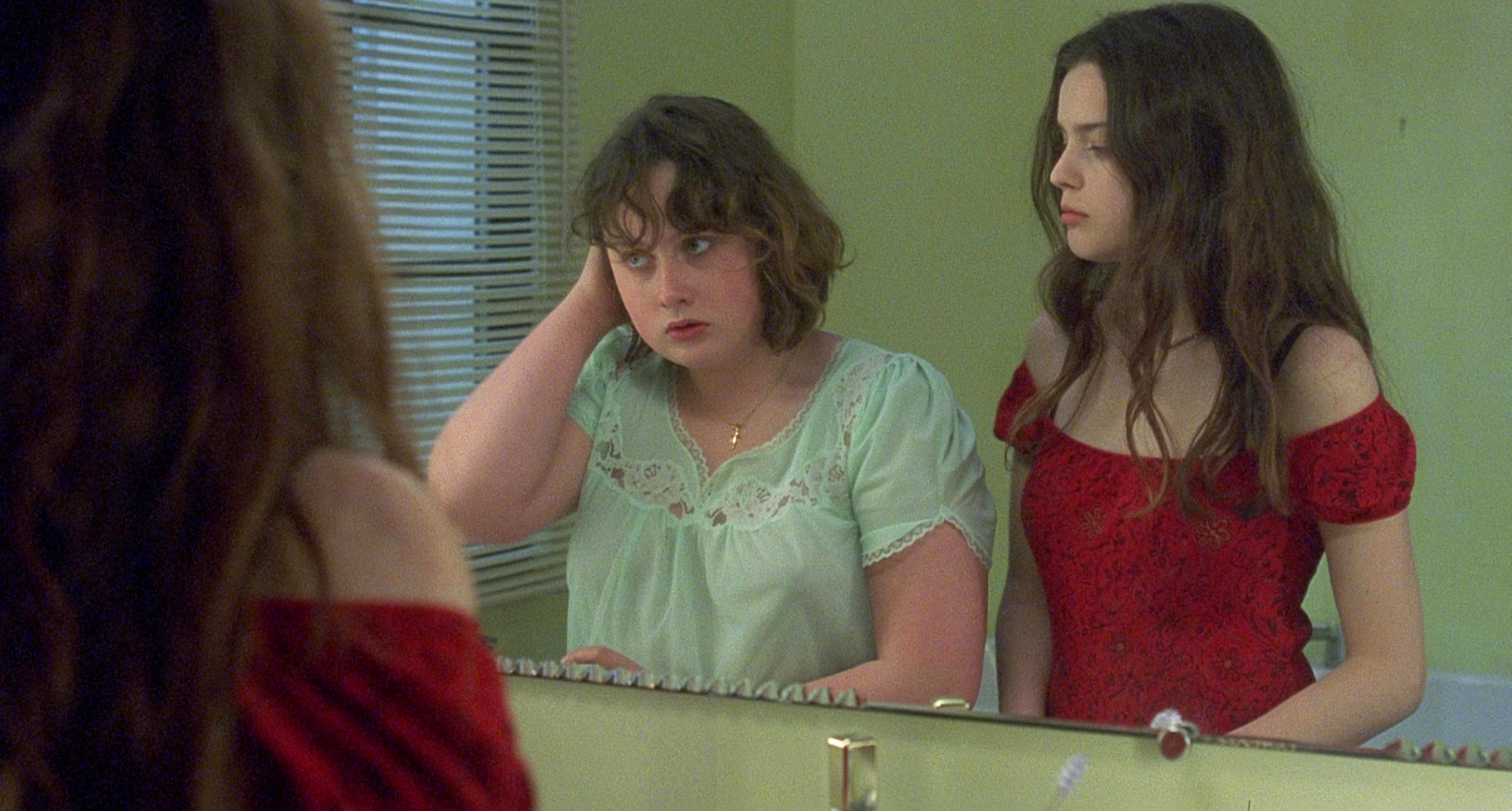
3. Michael & Susan – Blue & Orange
Michael meets Susan and is immediately captivated. At first, she shows some interest in him, but soon, she realizes that he is too immature and inexperienced. From then on, although she sometimes shows him appreciation, she begins to treat him with disdain.The relationship M-S is defined through color, first, by the opposition between different color temperatures cold-warm (blue-orange) and, second, by the dynamism that results into the interaction between complementary colors (blue-orange); thus creating a vibrant and dramatic relationship of attraction-rejection between both characters.**See 13th section.
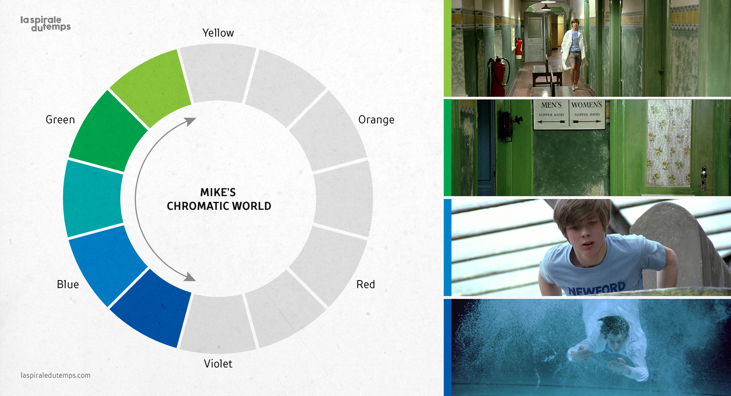
4. Mike’s chromatic world
Michael’s experience is less than the world he has to discover. The color spectrum known to Michael is limited; at this point he moves within a small range of colors, between greens and blues.His chromatic world belongs to a range of cold colors and as he grows up, he will expand his range of colors, understanding more (chromatic) aspects of life; he should chromatically reach adulthood.
5. Casting
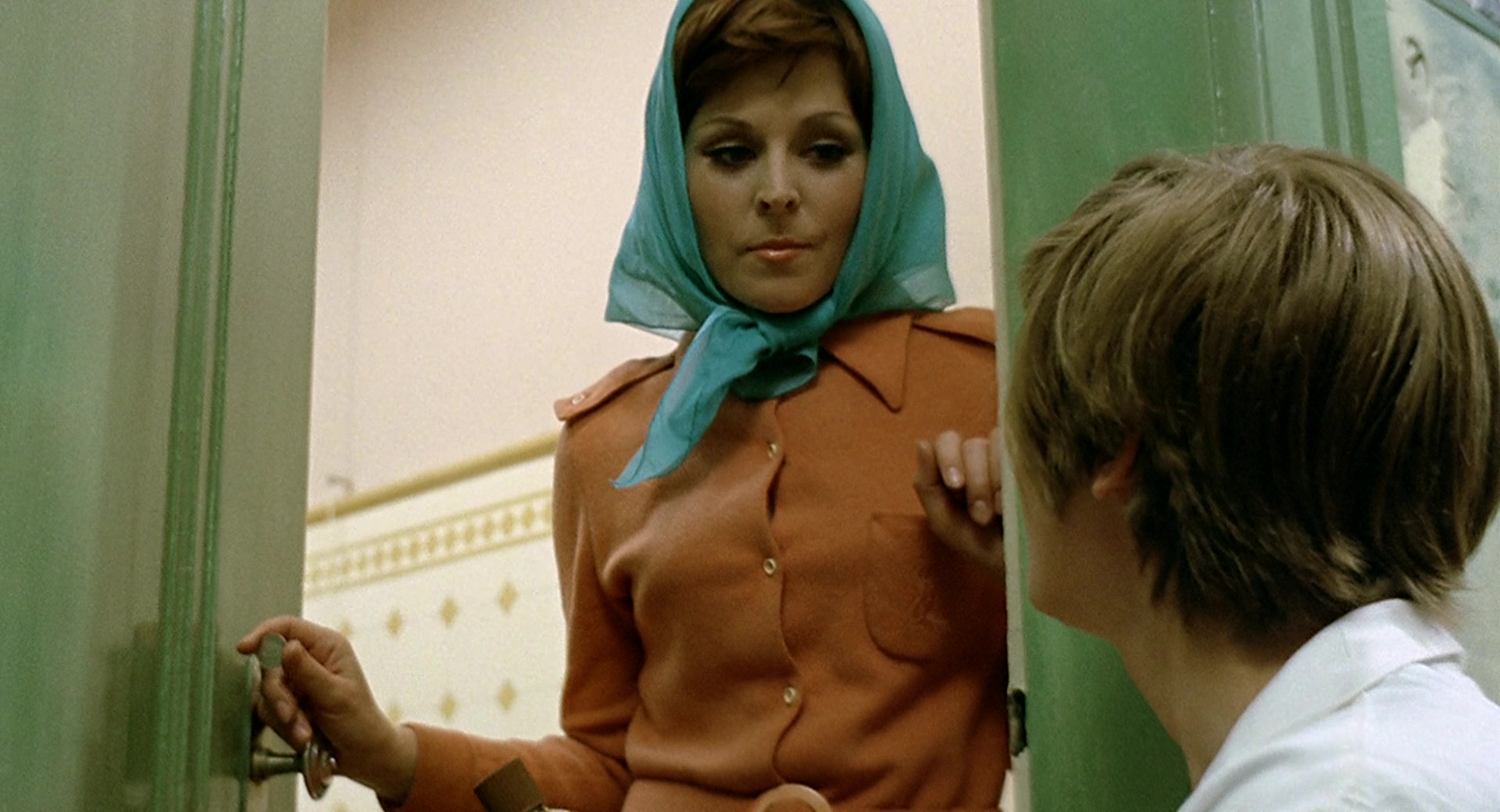
We do not know if Jerzy Skolimowski had this color scheme in mind beforehand, or if it was defined after the casting. In any case, the fact of taking into account the physical appearance —she has red hair and he has blue eyes— of the actors for the visual work is worth commenting on.
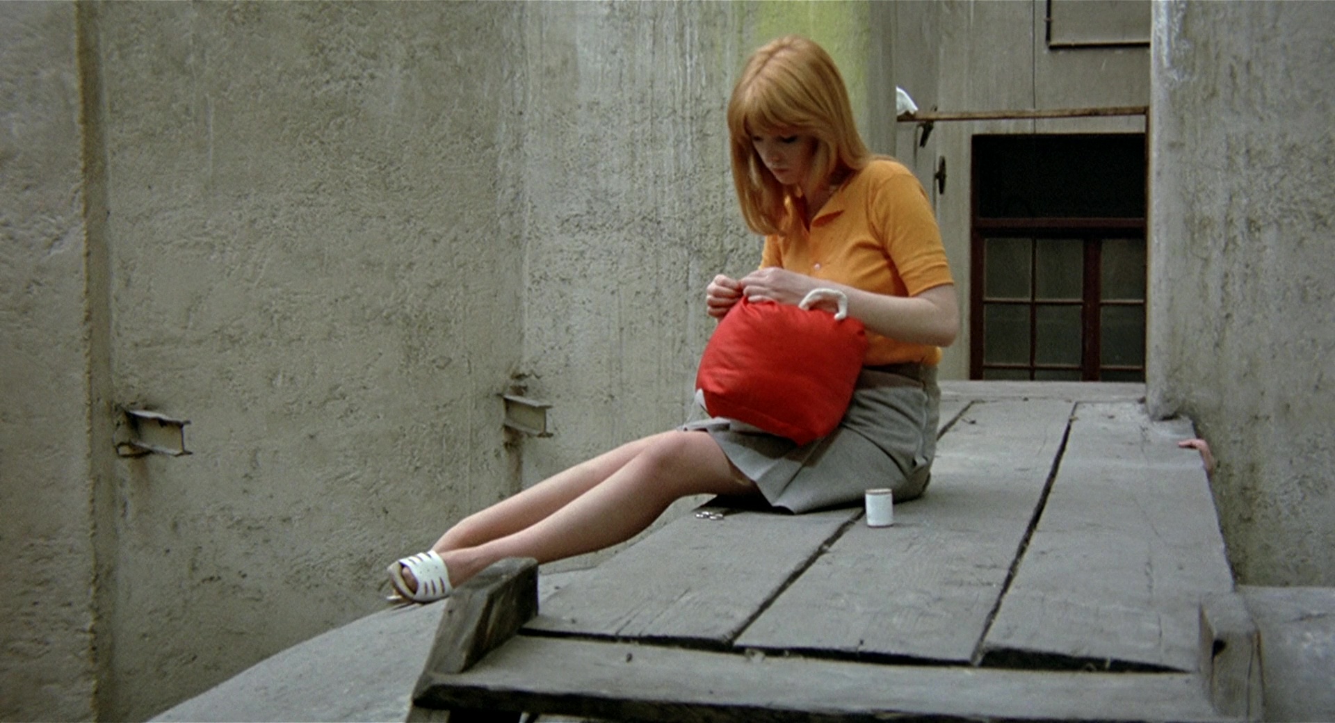
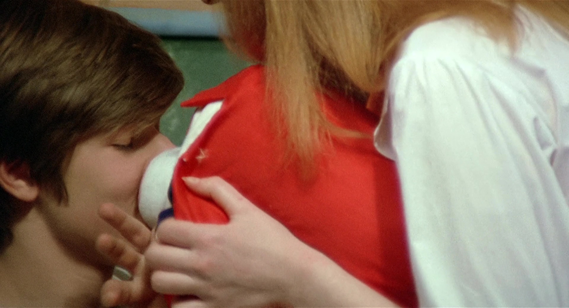
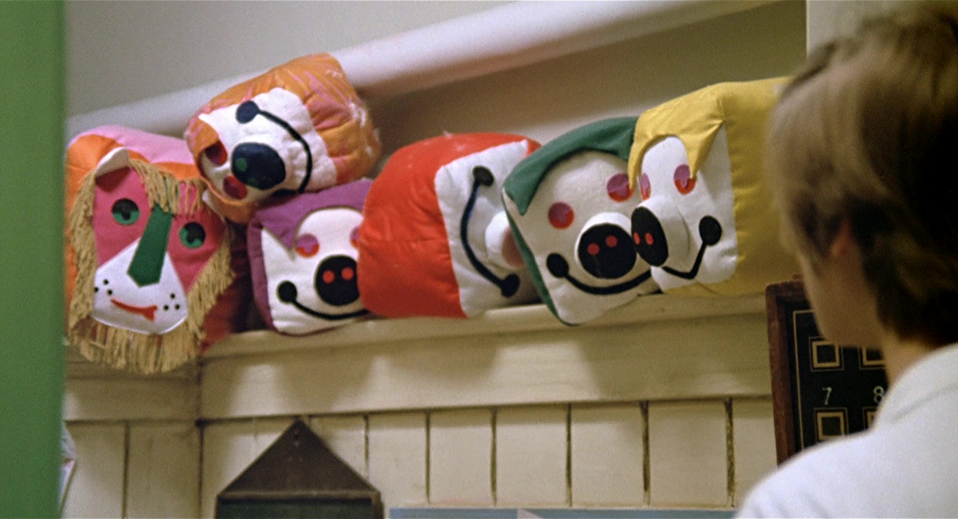
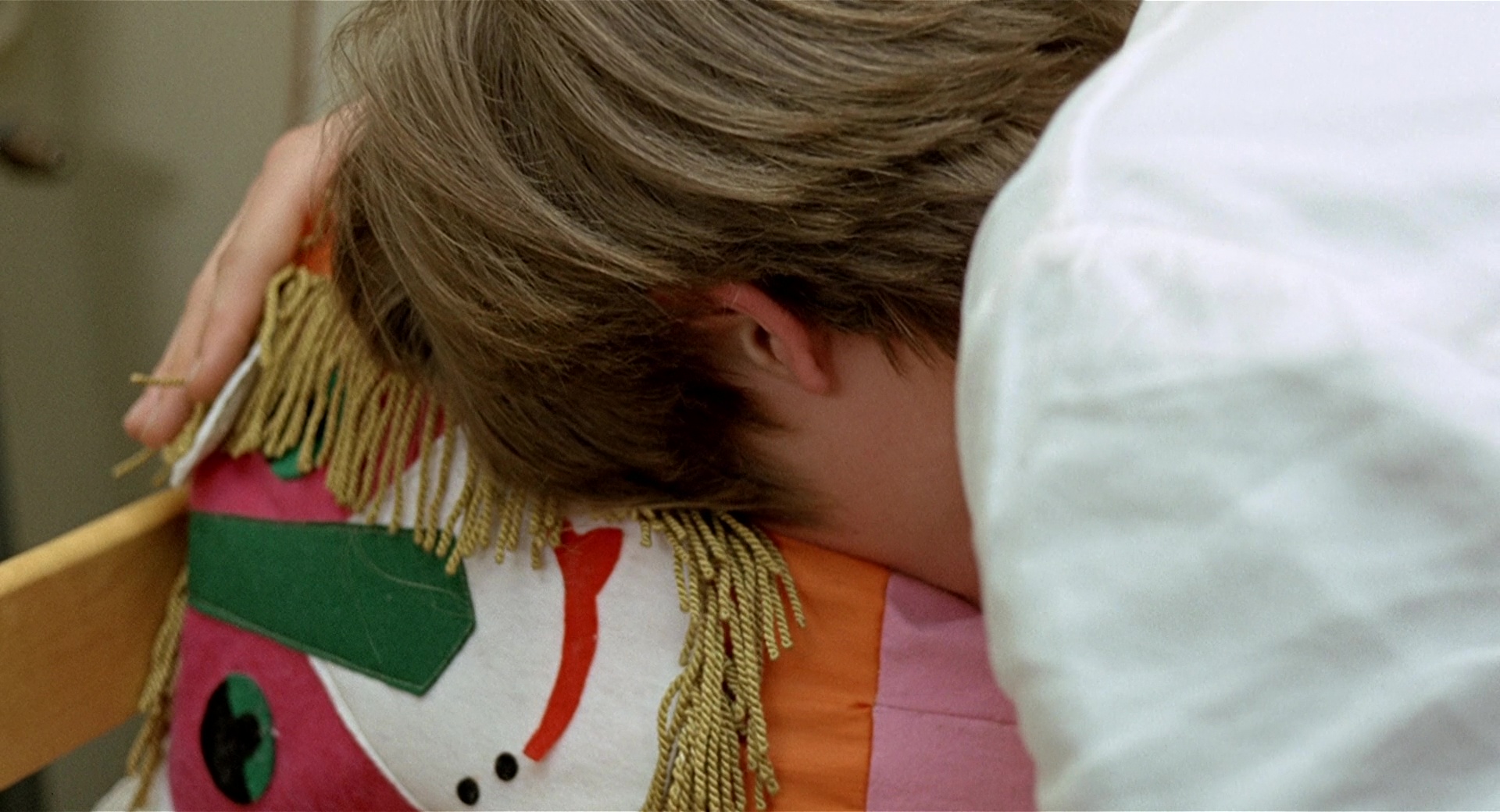
6. Use of props
The use of this color scheme can also be seen through the props, for example, with the orange stuffed animal that also serves as an emotional channel in moments of play, rapport, humiliation, rage or heartbreak.
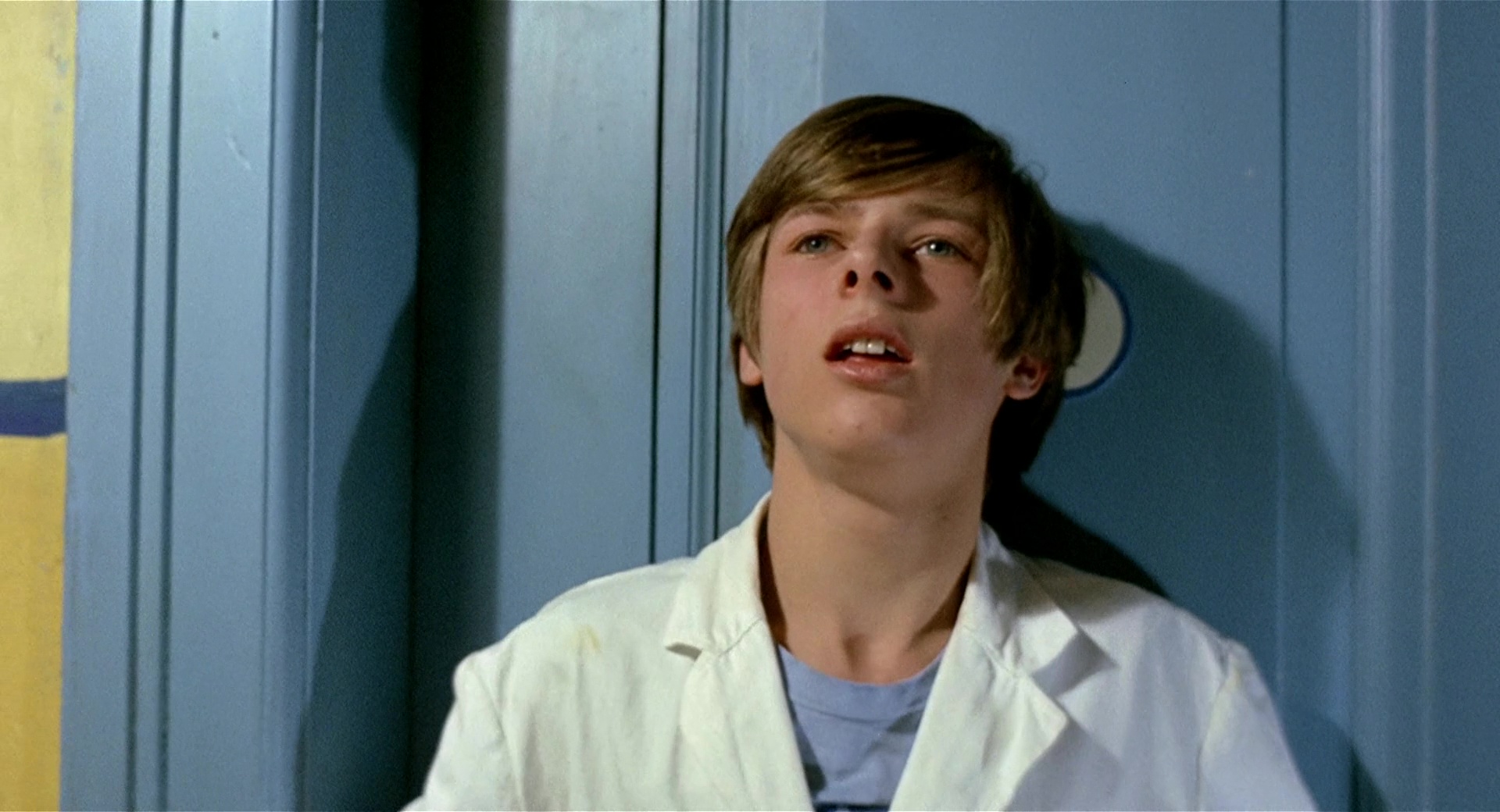
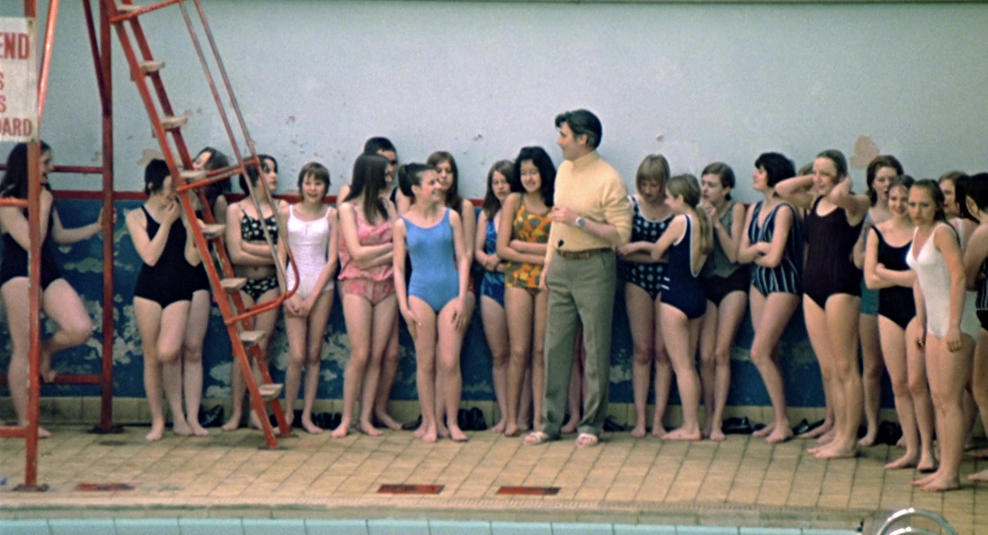
7. Green
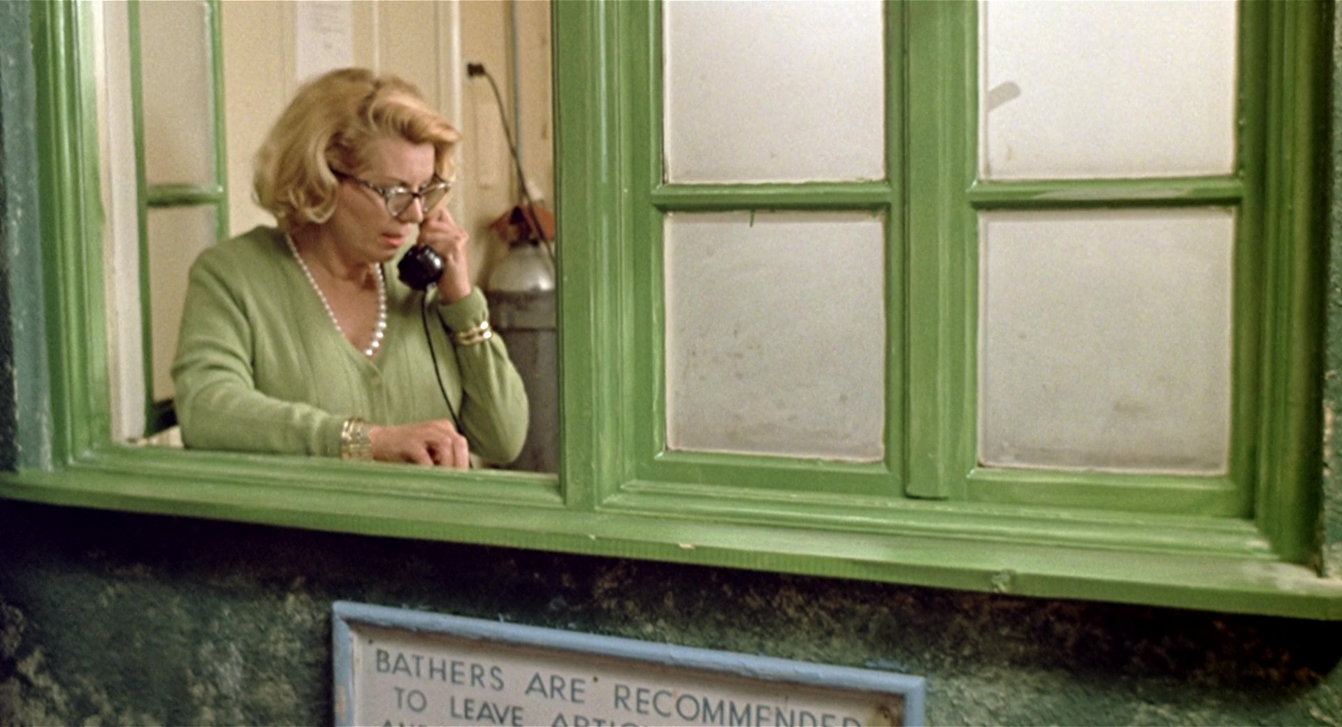
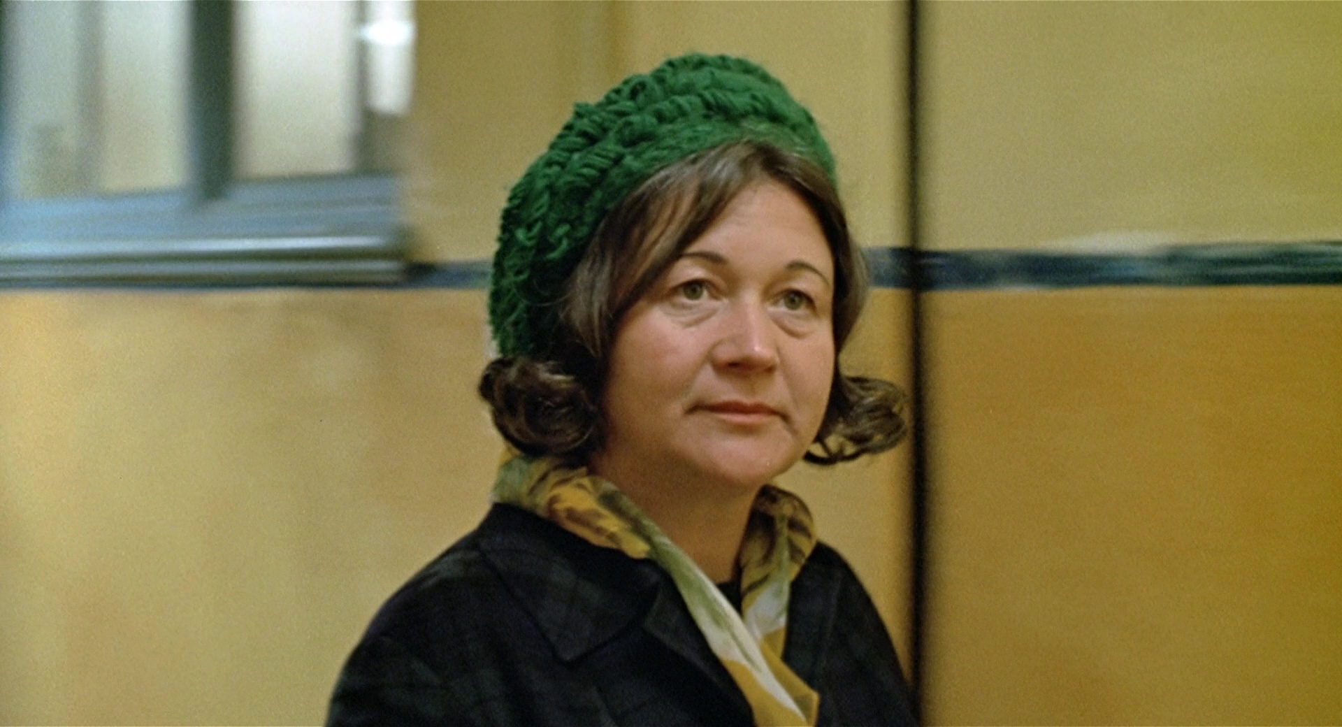
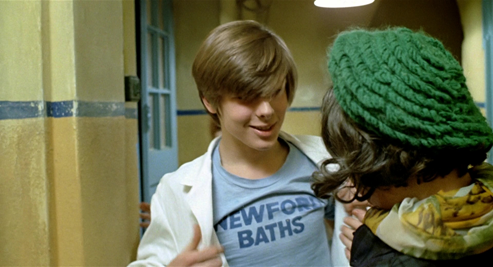
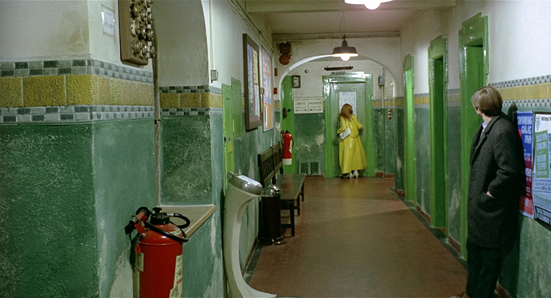
Puberty also means learning, first-time experiences, uncontrollable situations and unknown emotions. GREEN works for Michael as a balance of all this whirlwind of emotions and situations; a regulator point.The concepts associated with GREEN color range are those related with stabilizing or neutral elements, such as working in the Baths, which has become a familiar place due to his daily routine; shown through green in decoration and the Cashier’s clothing; or in some clothing that Mike’s mother wears. For this reason, her presence gives him confidence and security.It is also noted that although the Cashier (Erica Beer) is attracted to Michael, he does not share that same interest. She belongs to her labor world and he perceives her as a familiar, warm and harmless person. For this reason, she wears green and not orange like other women. Don’t forget that the film is narrated from M’s point of view.
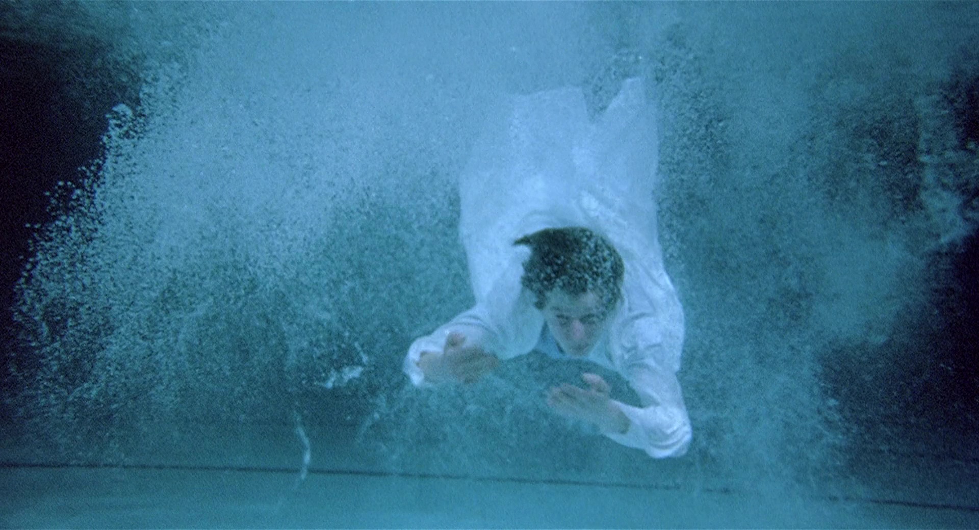
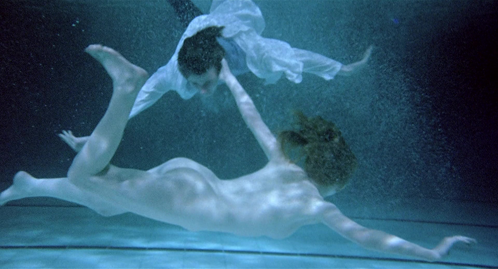
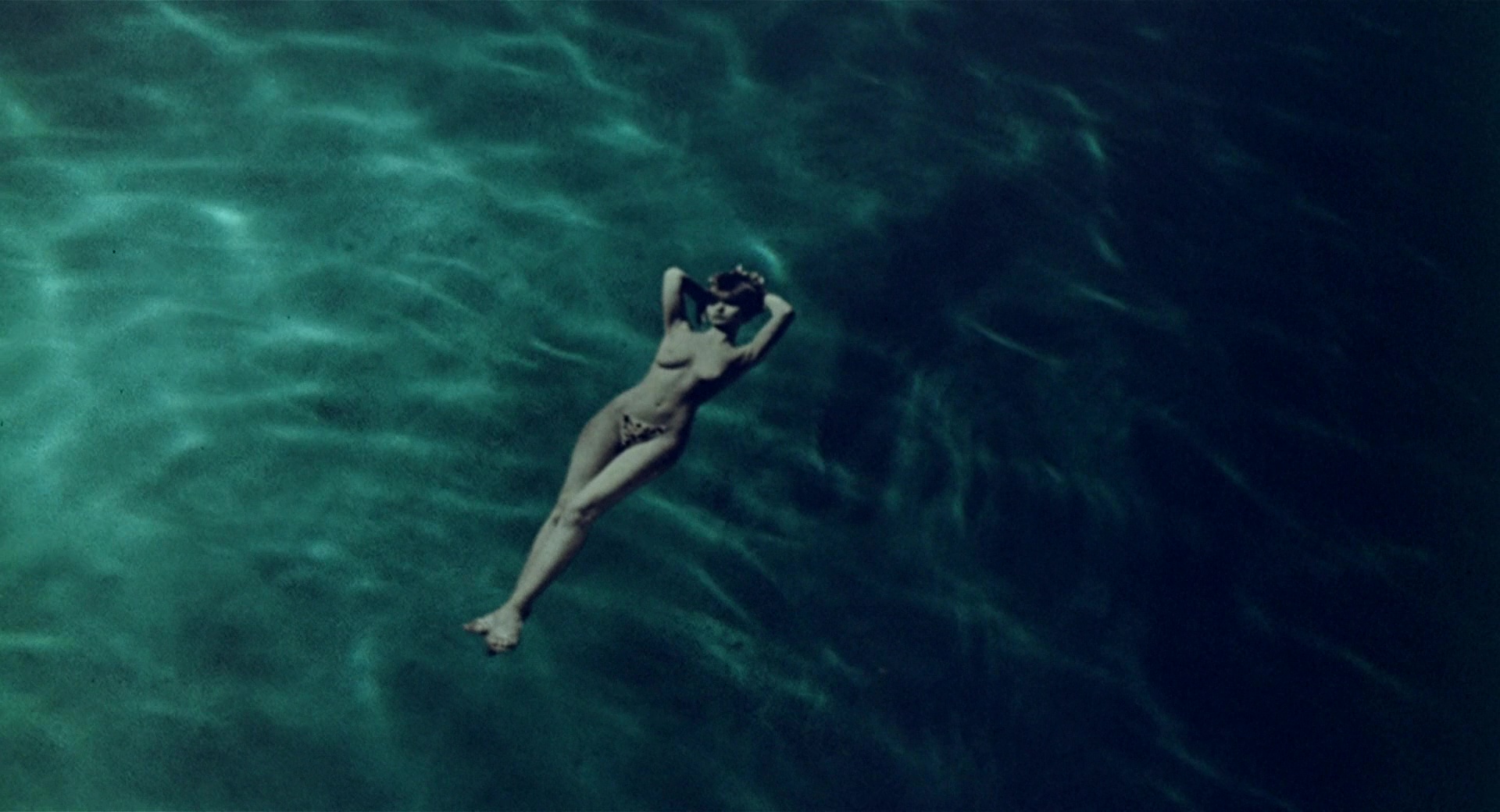
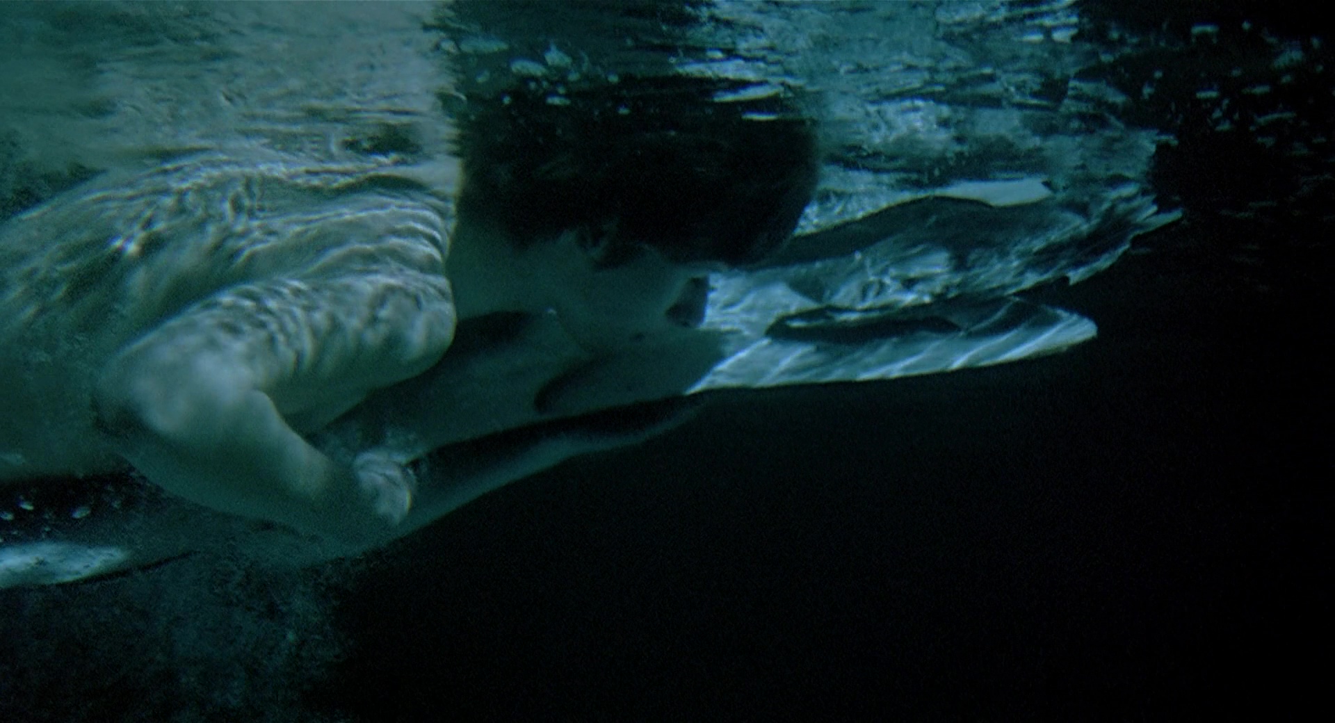
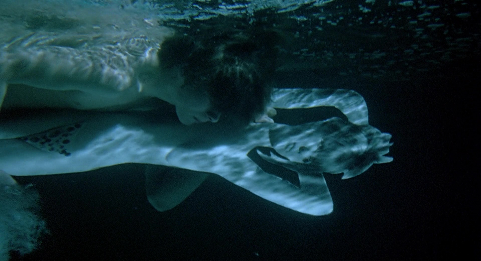
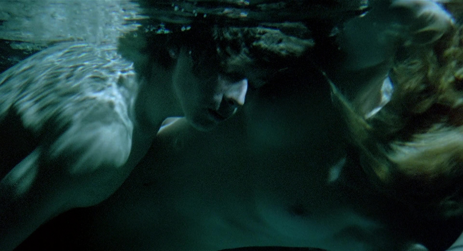
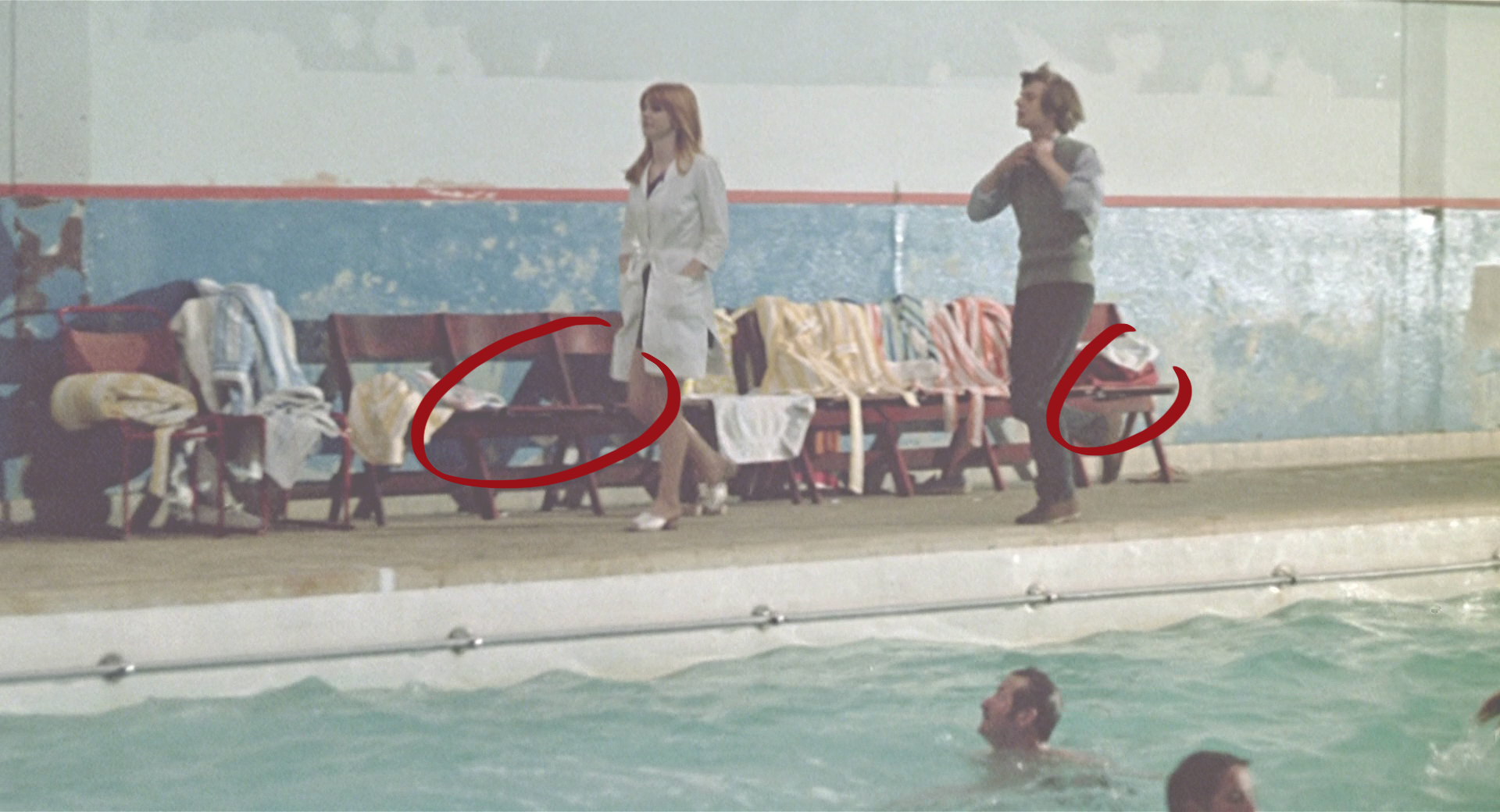
8. Pool
The Baths is the only space throughout the entire film that displays a unique chromatic aspect. This is where Michael has greater control over the color, since the water is always blue, unless it is dyed with another color, or the pool emptied.Every time he is immersed in water, Mike activates —the image is completely dyed blue— a dimension where fantasy comes to life, freedom takes shape and daydreams are unleashed. It is within this dream dimension where M can fantasize about a world tailored to him, where everything fits as he would like.And it is where Skolimowski takes the opportunity to include small doses of poetic, suggestive and evocative images that takes us on the border, between the feasible and the unusual, between the recognizable and the alien.
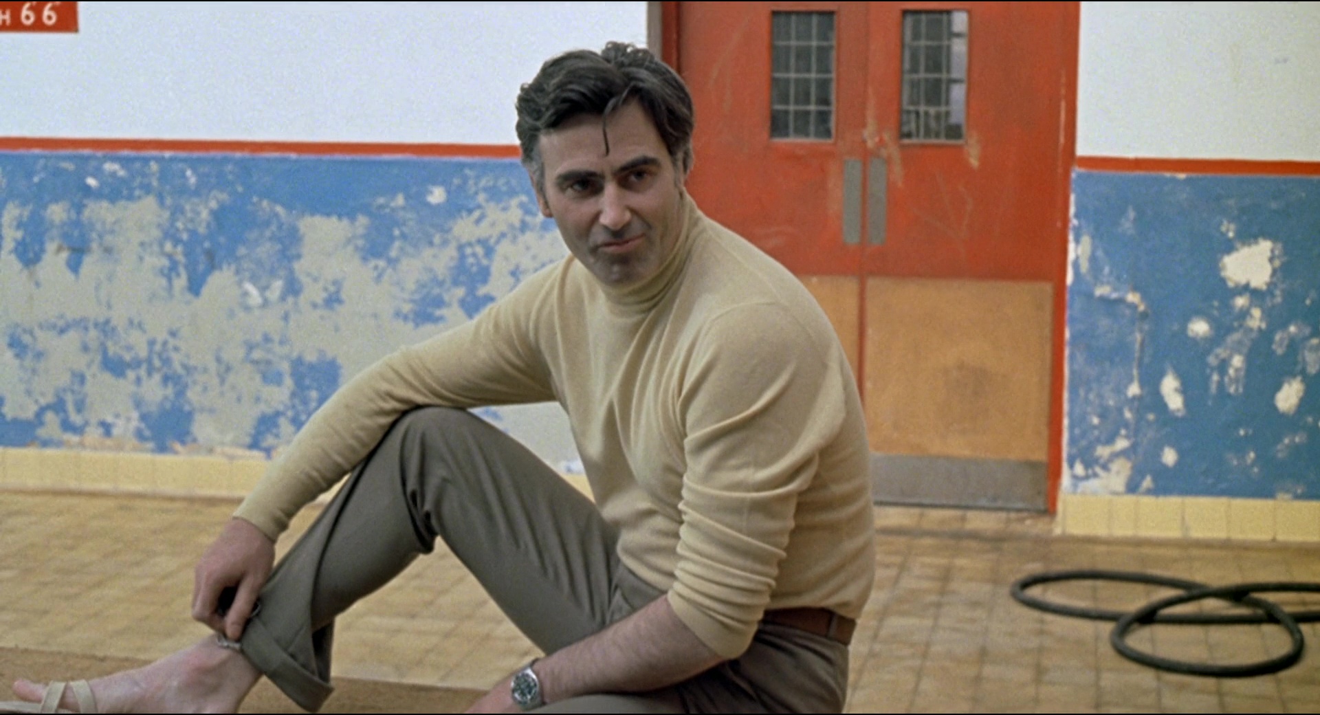
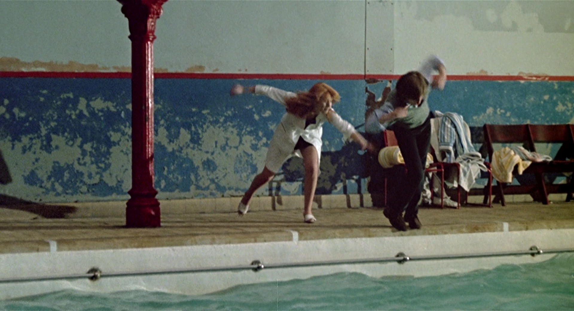
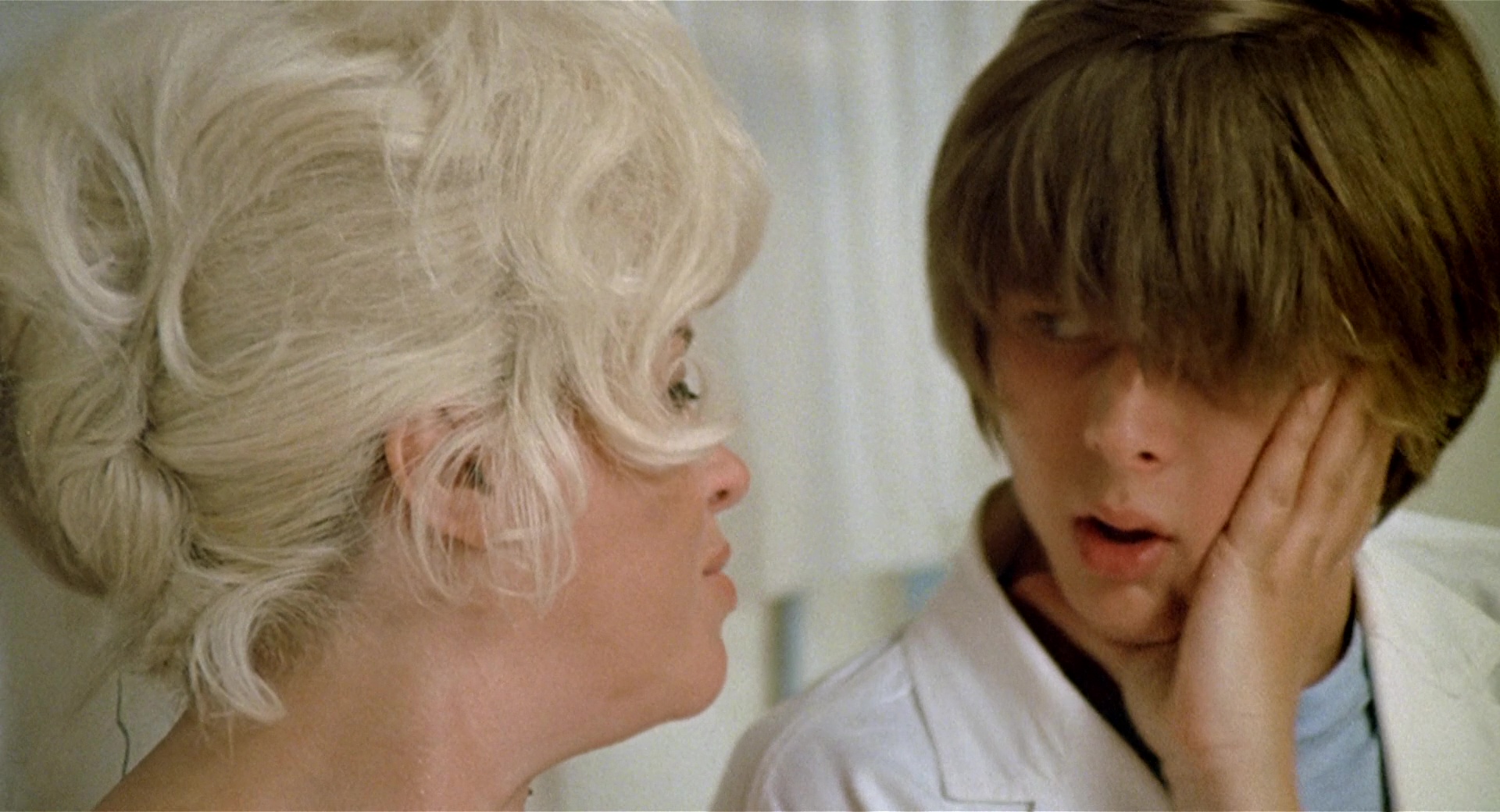
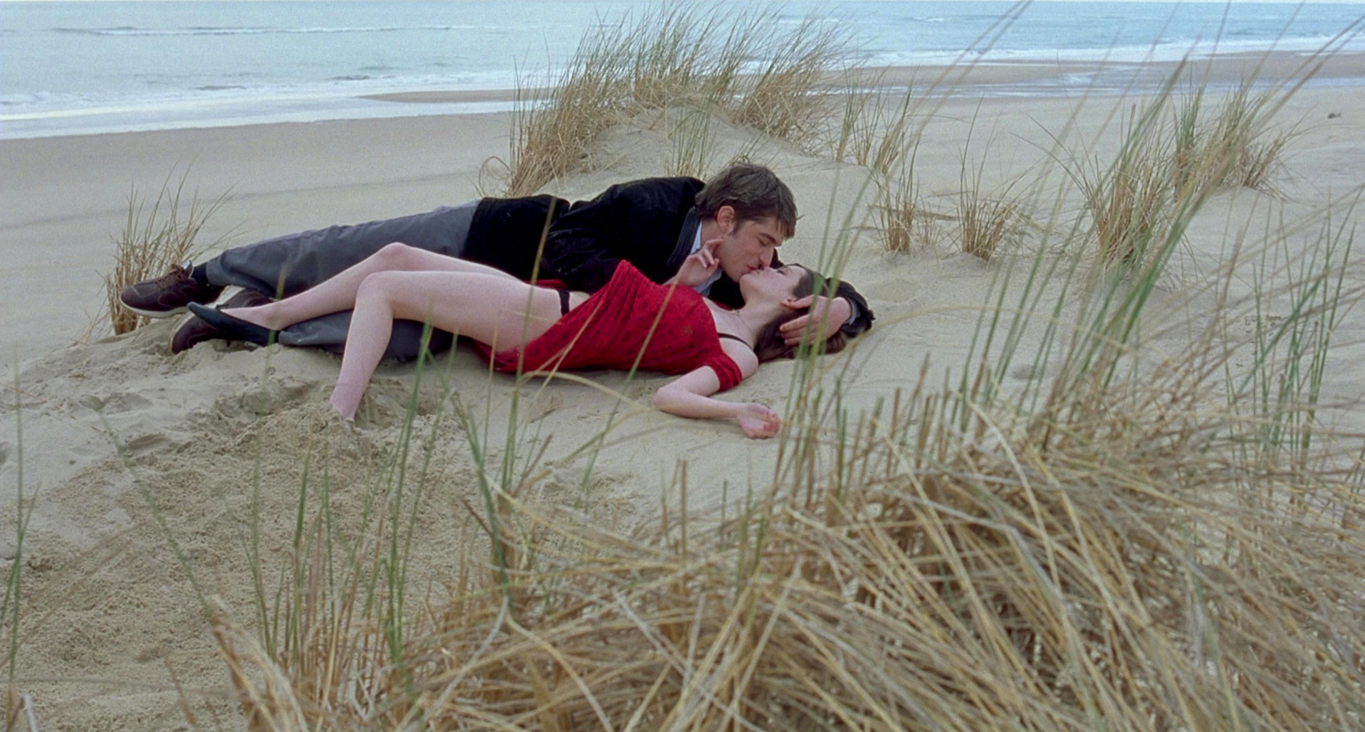
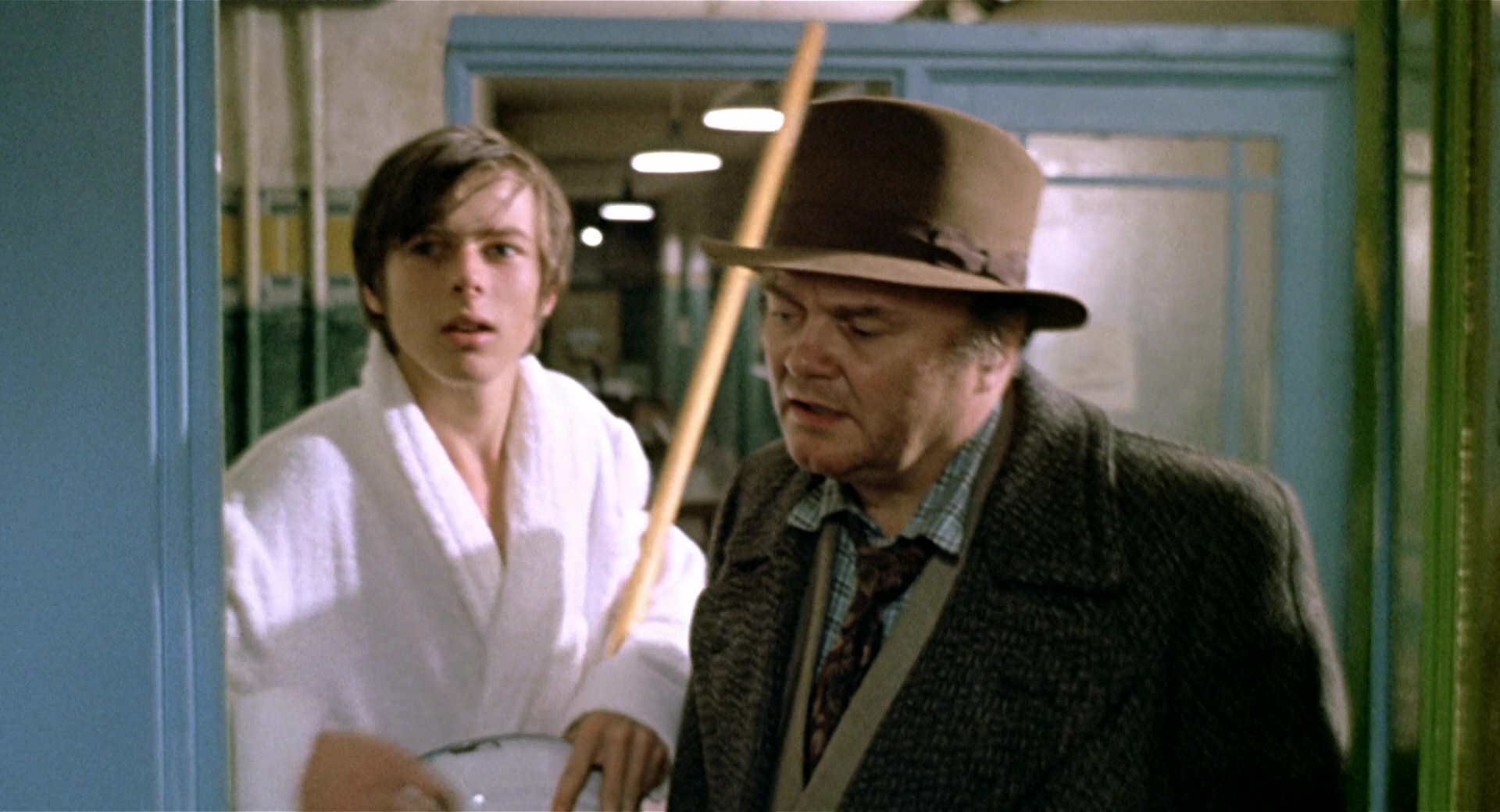
9. Red
But it is at the same time in this room, the Bath’s pool room, where most characters crash into Michael’s chromatic world and destabilize it.Here, the figure of the Professor (Karl-Michael Vogler) appears surrounded by red elements: doors, columns, railing boxes or the inside tartan fabric of his jacket.The relationship M-P is also defined through color, first, by the opposition between different cold-warm color temperatures (blue-red) and, second, by the resulting clash between complementary colors (green-red); RED is thus established as an instable and negative counterpoint for Michael.The arrival of the Professor (red color) accompanied by the group of students (chaos and incoherence of mixed colors) are the first chromatic incentive that introduces arguments and disagreements between Mike and Susan, and which will increase as the story progresses.*See 26th section (Part II).
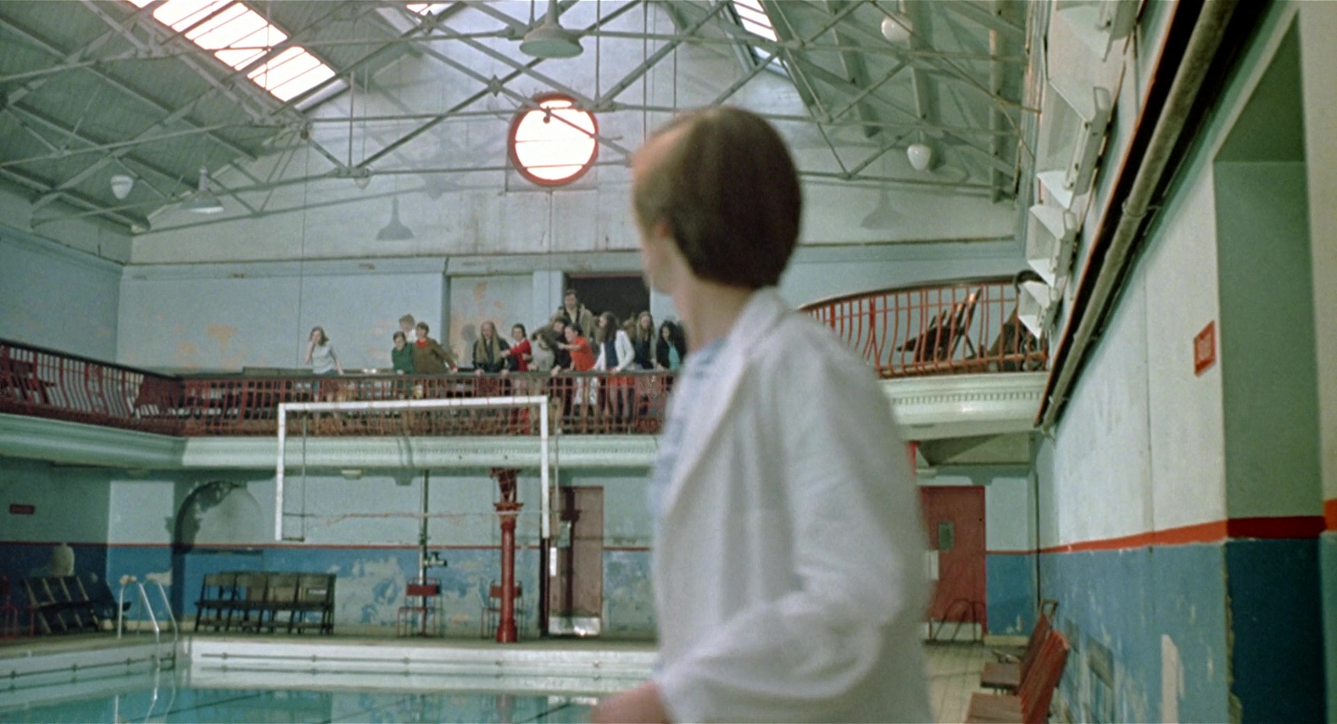
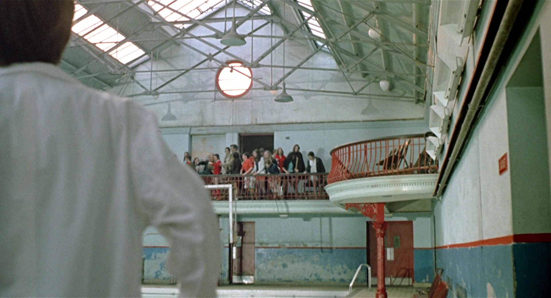
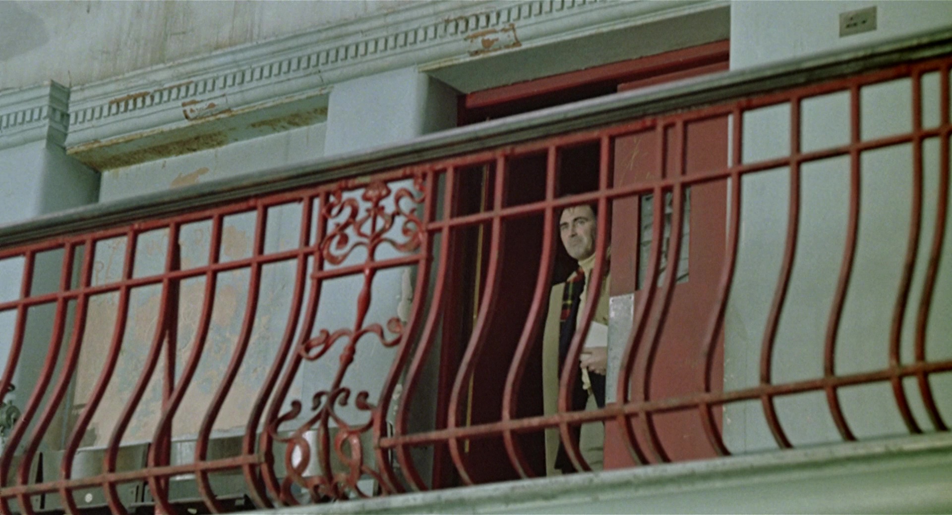
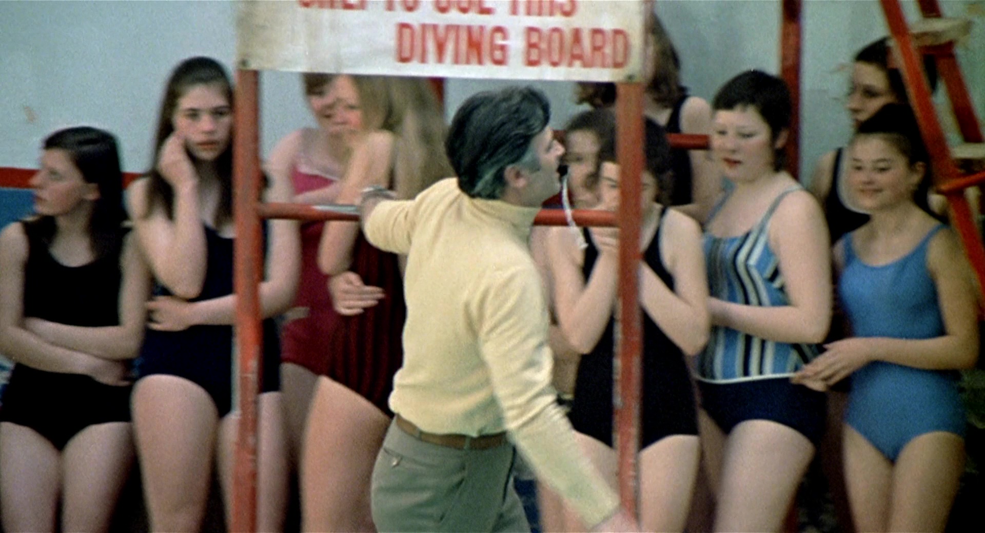
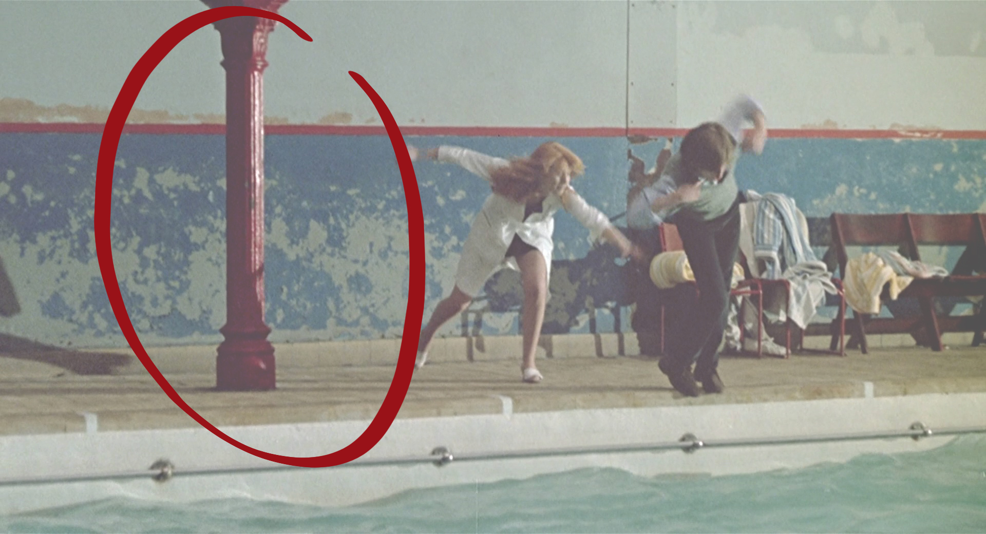
10. Red elements
If we recover the scene in which Susan shows Michael for the first time the space where the pool is located, the RED color already begins to have a certain presence. When the red column that supports the boxes comes into view, Michael loses his balance and slips and falls into the pool.
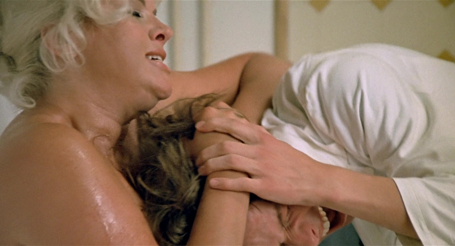
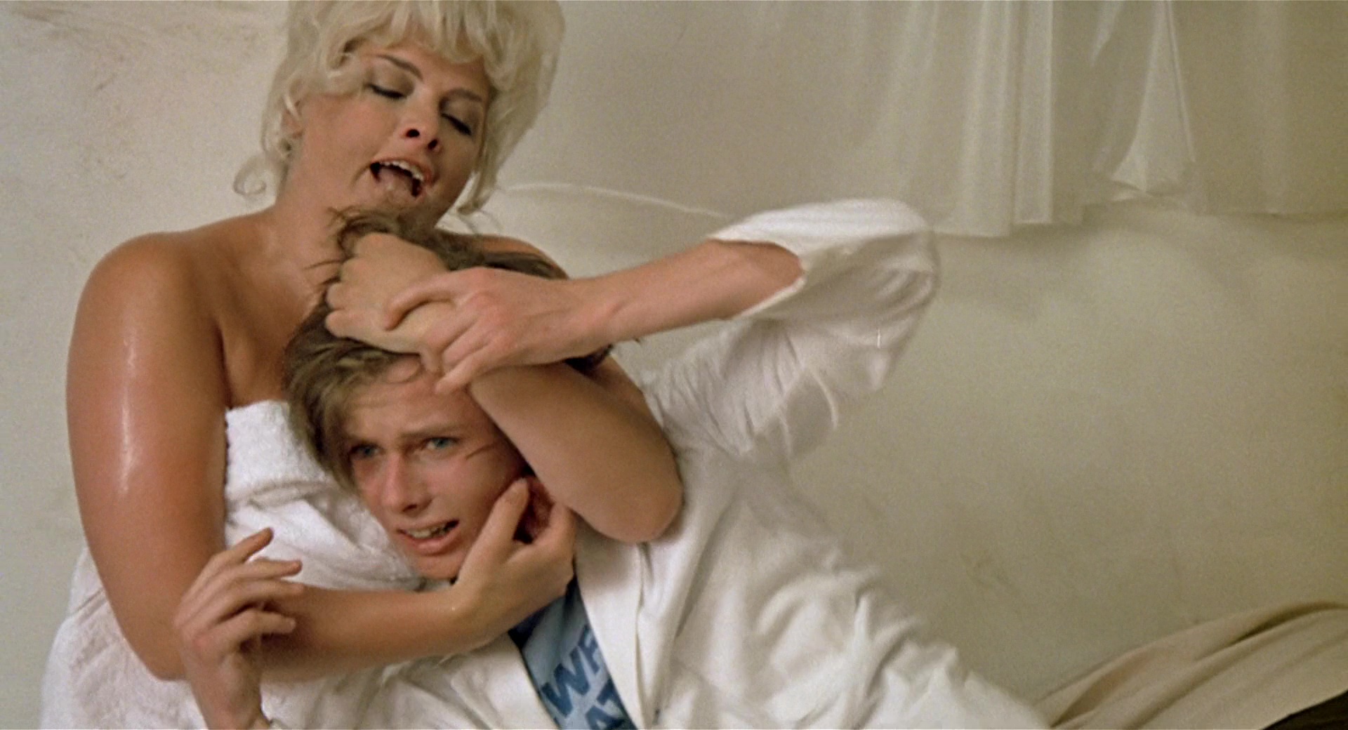
11. Violet
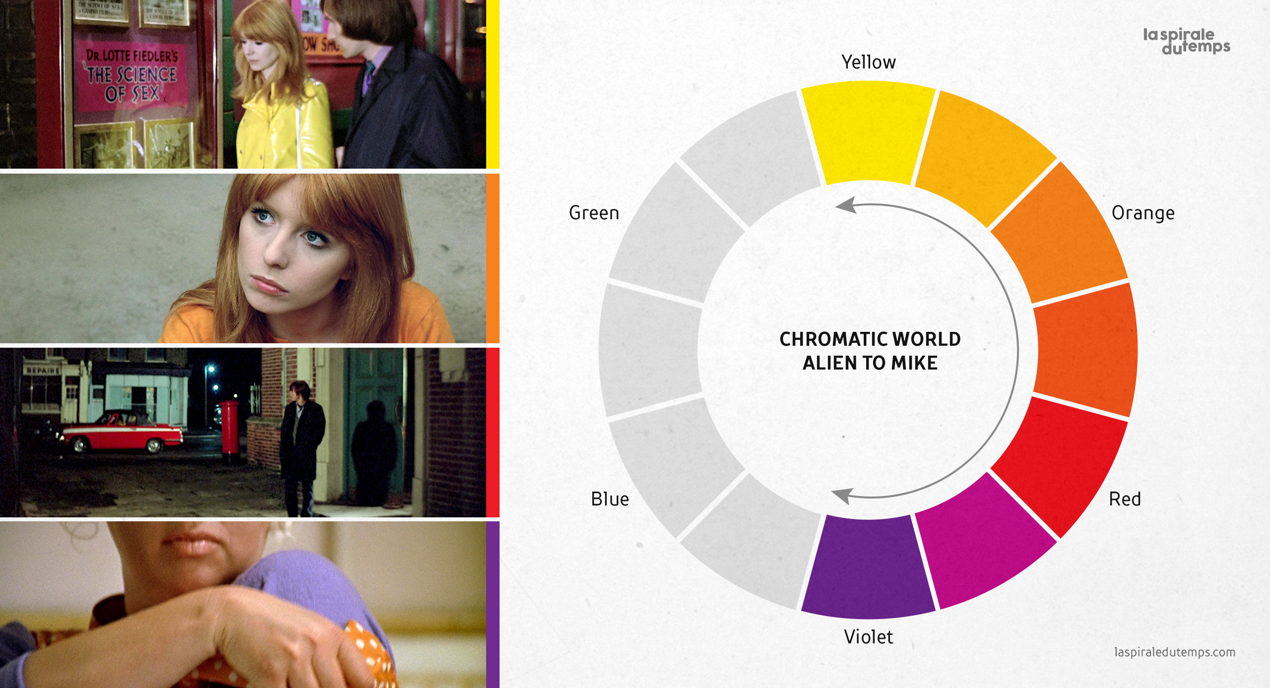
Once the concepts Blue-Orange and Green-Red are defined, Skolimowski introduces the third pair of complementary colors: Violet-Yellow. The chromatic range of VIOLET mainly alludes to the idea of eroticism, nudity, lust, sexuality, voluptuousness, or debauchery.These concepts are introduced through Diana Dors, the British actress who became an erotic icon of the 50s. Diana appears in a sequence where she tries to sodomize Michael and turn him into her erotic toy while they talk about soccer; a subtext dialogue that actually refers to sex rather than sports.Videos in the 30th section (Part II) show hostesses and strip clubs of the time. Most of them used purple colors for their shopfront signage and shop windows.
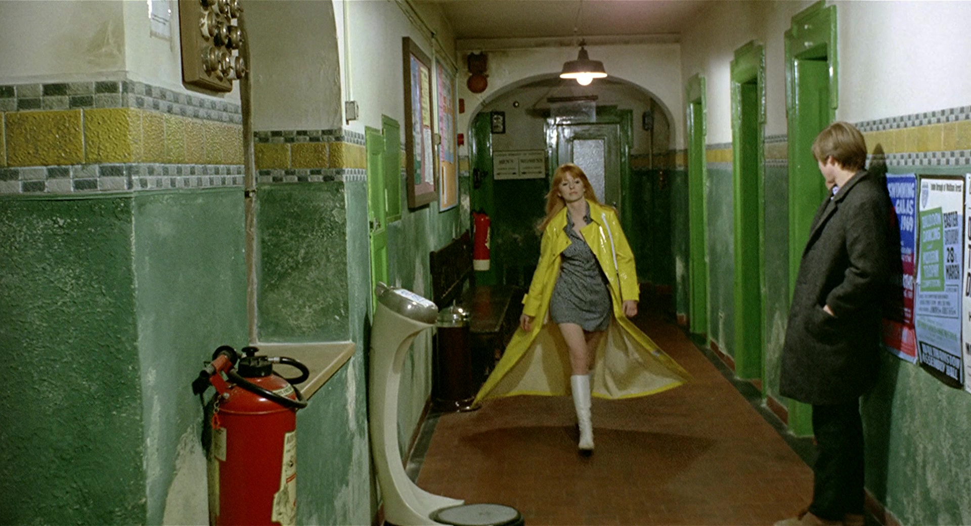
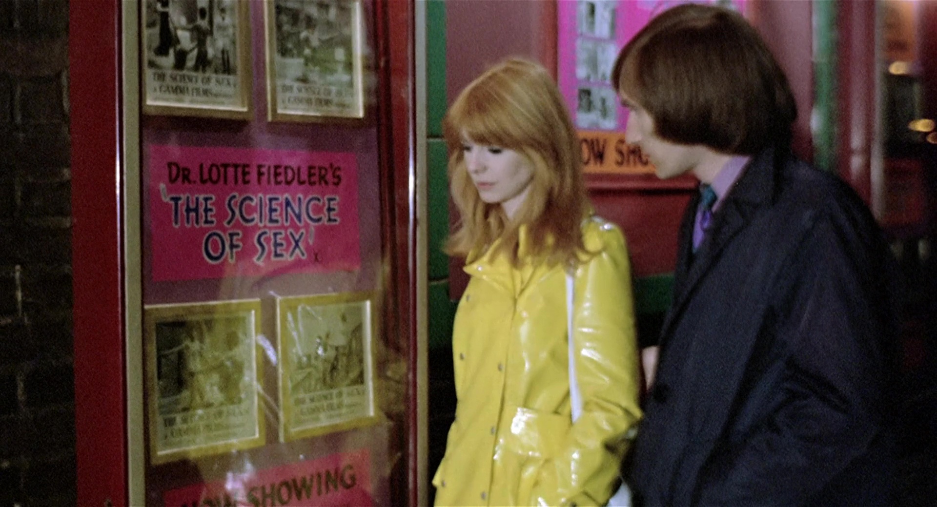
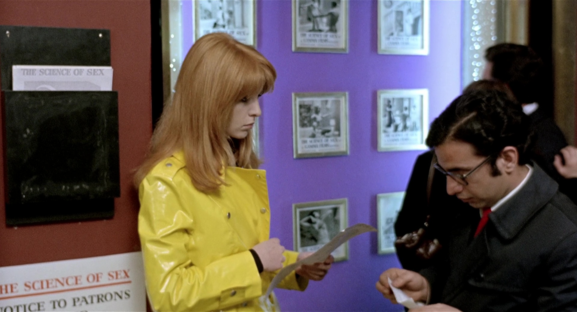
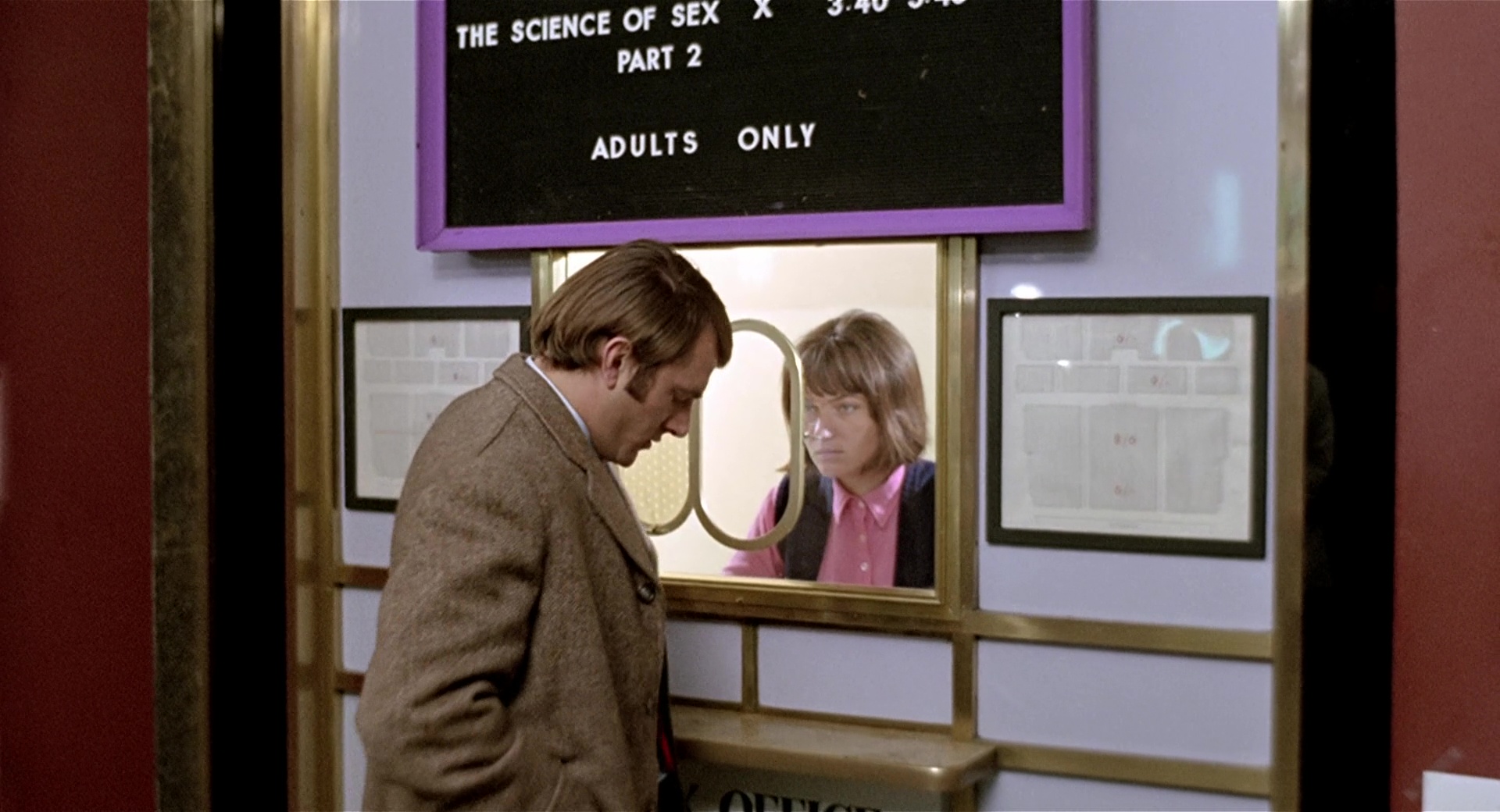
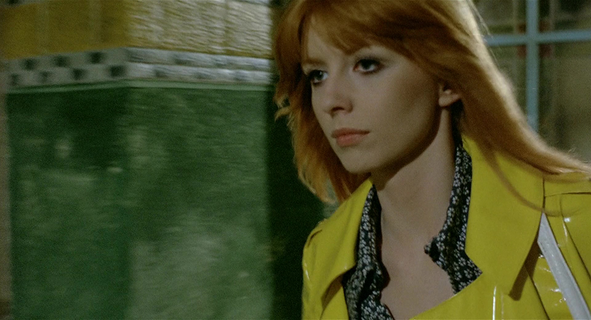
12. Yellow
Michael and Susan have finished their shifts. They are wearing casual clothes and preparing to leave the bathrooms; she is wearing a spectacular yellow patent leather jacket. It is the first time that M sees how S dresses outside of the work environment. The next time jacket appears is when we discover that Susan has a partner. She and her fiancé go to the movies to see a movie called «The Science of Sex.» This confirms she usually wears the yellow jacket in her free time, outside of work hours. The concepts that orbit around YELLOW color range are fun, emancipation, sexual and social liberation. In other words, everything that involved the Swinging London: a phenomenon that emphasized the youth, the new and the modern. A period of optimism, hedonism and a cultural revolution. The type of costume that actors wear in a film is relevant. Here it expresses modernity, uniqueness and empowerment. Patent leather fabric is more daring and transgressive than traditional cotton, as the Swinging Sixties were against the narrow mentality and British classism at that time.On the other hand, colors analogous to violet (red-violet and pink) are also associated with the idea of sexuality and debauchery, as we can see in adult film posters, Susan’s boyfriend’s suit or the girl’s shirt in Ticket Office. Yellow and Violet are complementary colors, they go hand in hand, so for Michael there is a direct relationship between Susan’s life outside her work environment (yellow) and debauchery, sexuality and lust (violet, red-violet and pink). For M, yellow becomes a concept that is far from attainable. Outside the Baths there is another world where Susan belongs, and where M still hasn’t discovered and is craving to be part of it.
13. Structural relationships of the color wheel
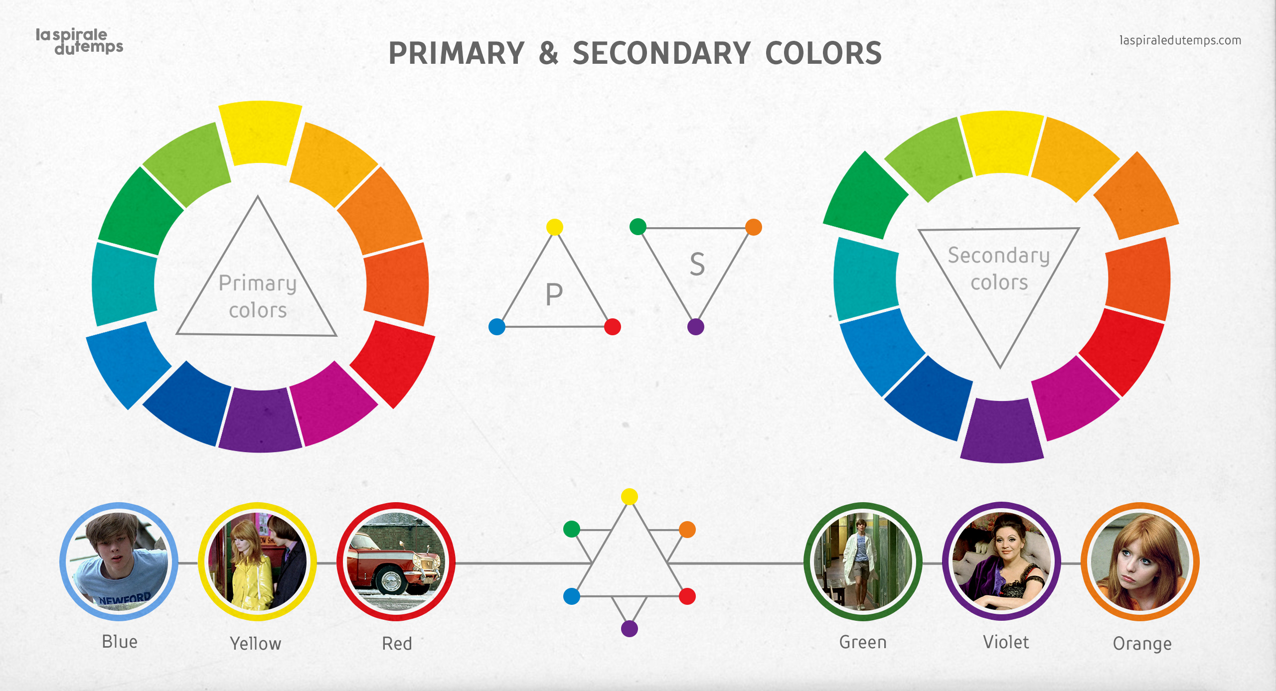
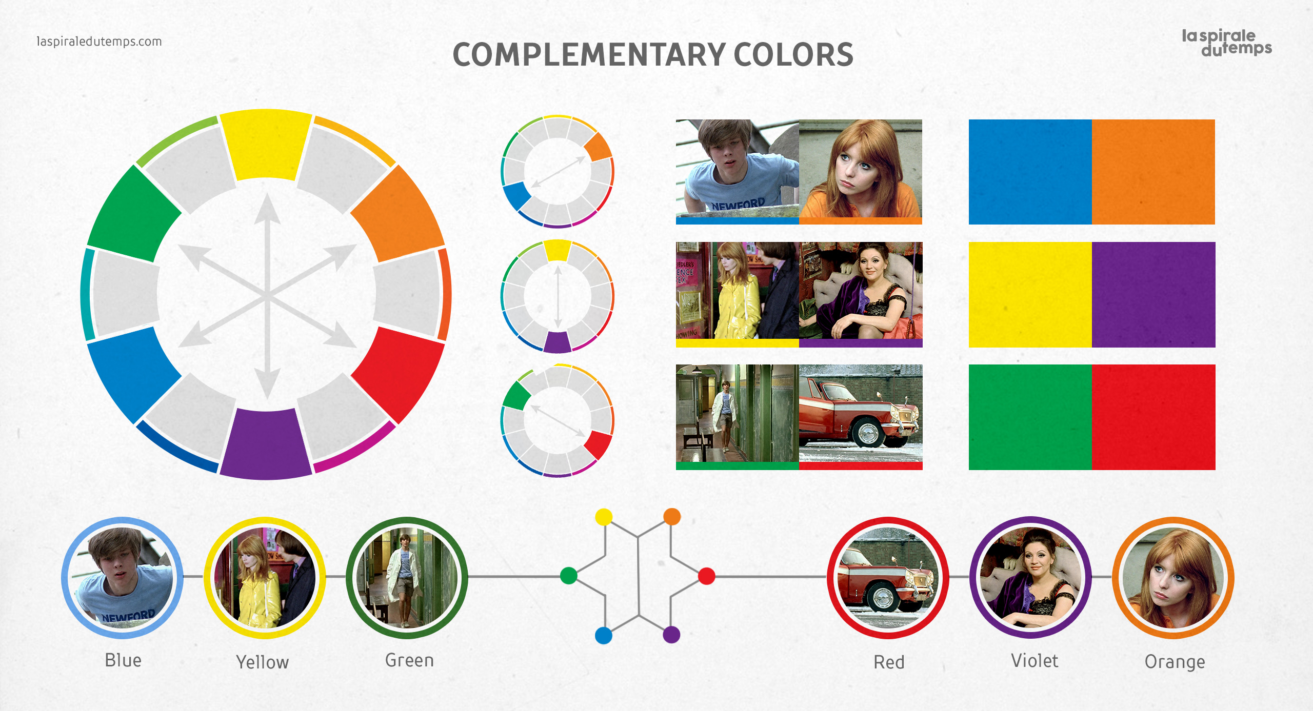
The chromatism in this film is based on a contrast scheme between chromatic chords or harmonic duos (complementary colors), that is, on a dynamic relationship between characters and concepts that contrast with each other.To understand these relationships, we must know the following concepts: PRIMARY colorsBlue, yellow and red have never been mixed up with any other color, so that they are considered primary colors. If you put these three colors together on the 12-part color wheel, you get an equilateral triangle. In this triad all the strength and power of colors is expressed (Itten, 1970). Not to be confused with the three primaries of process printing: cyan, magenta and yellow (CMY). Not even with the three primaries of light (the so-called additive colors): red, green and blue (RGB). SECONDARY colorsOrange, violet and green are called secondary colors. Just like the primaries, these three colors are equidistant from each other on the color wheel. They are called secondaries because, theoretically, they are born of primary parents: orange derives from red and yellow, violet from red and blue, and green from blue and yellow (Edwards, 2004). COMPLEMENTARY colorsThey are the colors that are diametrically opposed on the color wheel. A complementary color which comes from a primary color will always be a secondary color. The highest contrast colors occupy opposite places on the color wheel. Placing them side by side increases the vividness or intensity of both (Edwards, 2004). The main pairs of complementary colors are: Blue-Orange / Yellow-Violet / Red-Green. By placing complementary colors together, both intensify each other, making them ideal for generating harmony, vibration, exaltation, drama, movement and dynamism.Two complementary colors oppose and need each other, and when together they acquire maximum luminosity (Itten, 1970).
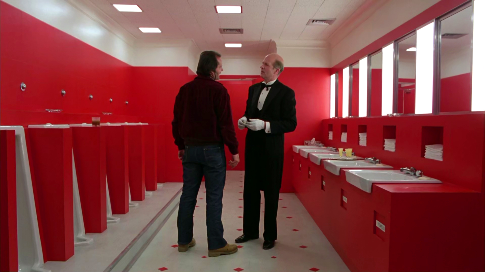
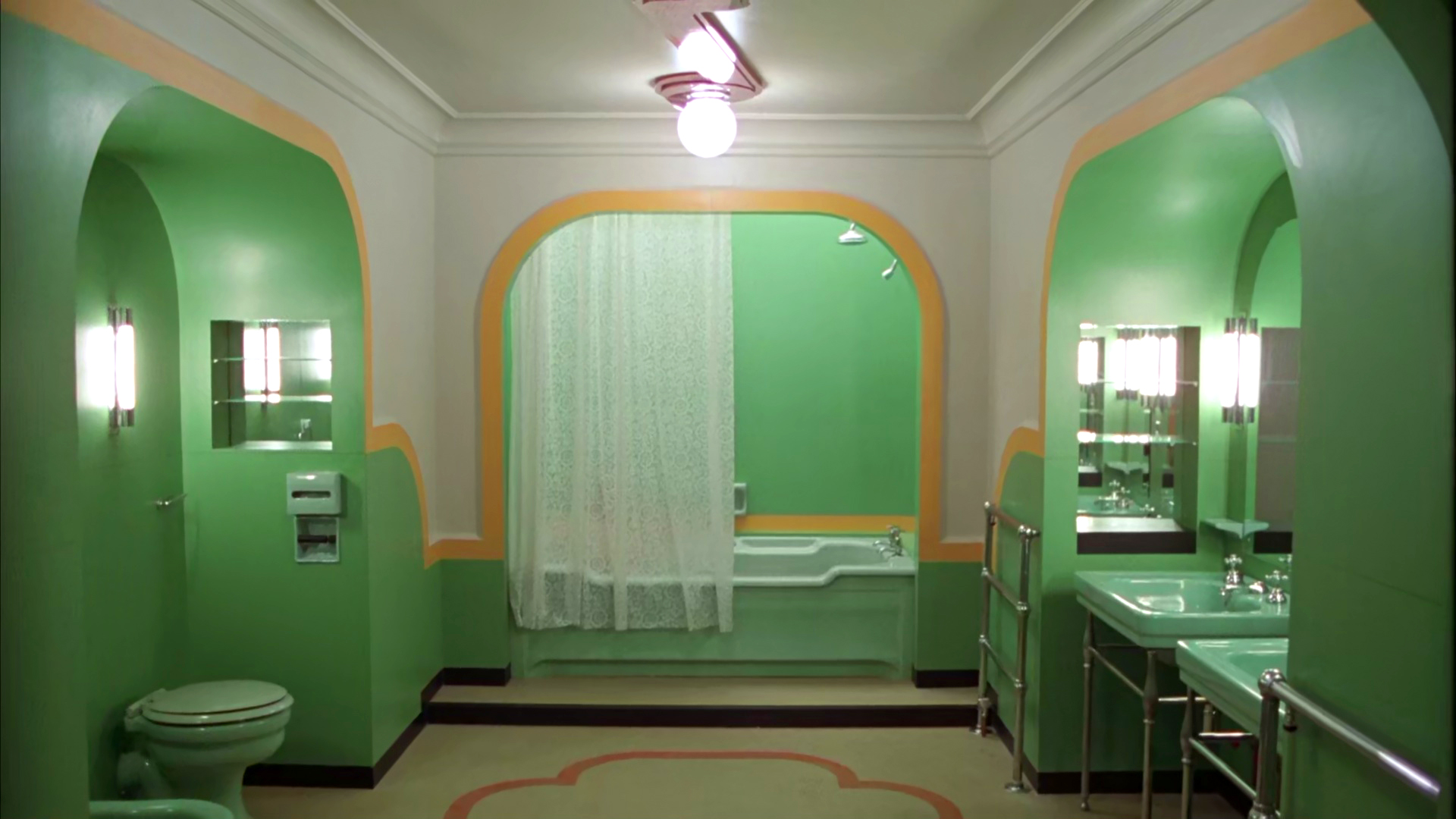
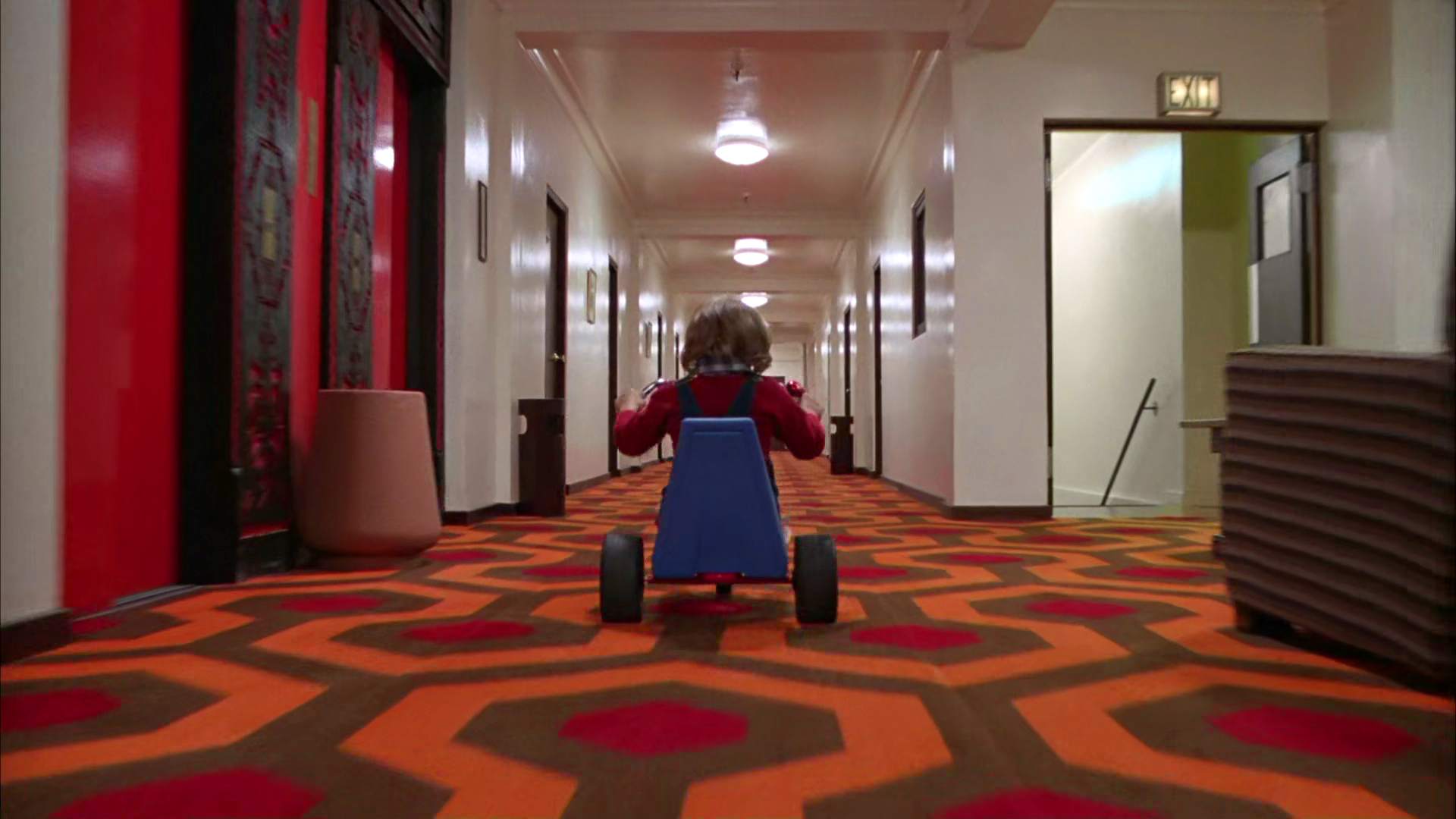
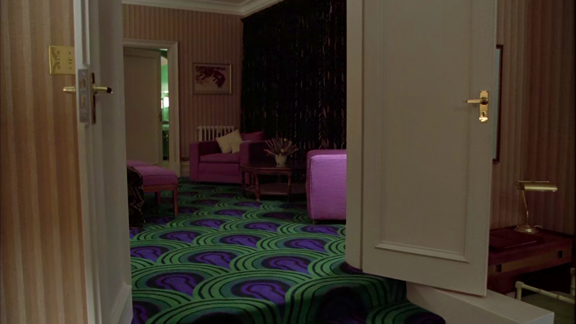
14. Complementary colors
The shinning 1980 – Stanley KubrickJack Torrance (Jack Nicholson) and his family find themselves immersed in a nightmare inside the Overlook Hotel. Terror and madness are reflected in the vibration and friction between complementary colors.
À ma soeur! (Fat girl!) 2001 – Catherine BreillatThe difference in personalities among siblings Anaïs Pingot (Anaïs Reboux) and Elena Pingot (Roxane Mesquida) are represented using complementary colors. They also describe their different positions and attitudes towards sexuality in adolescence.
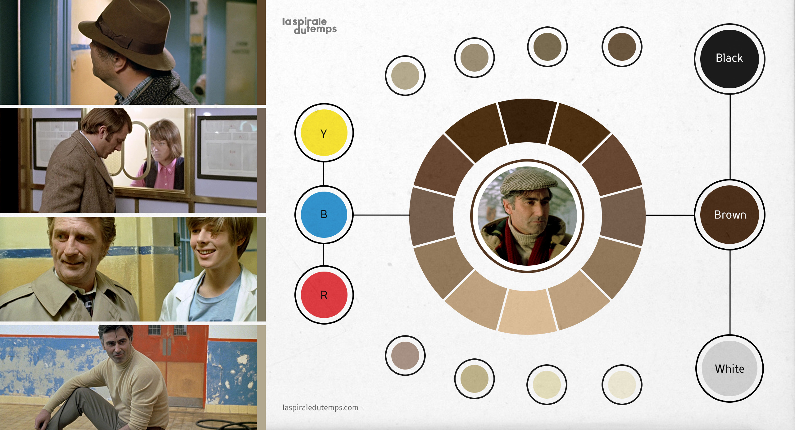
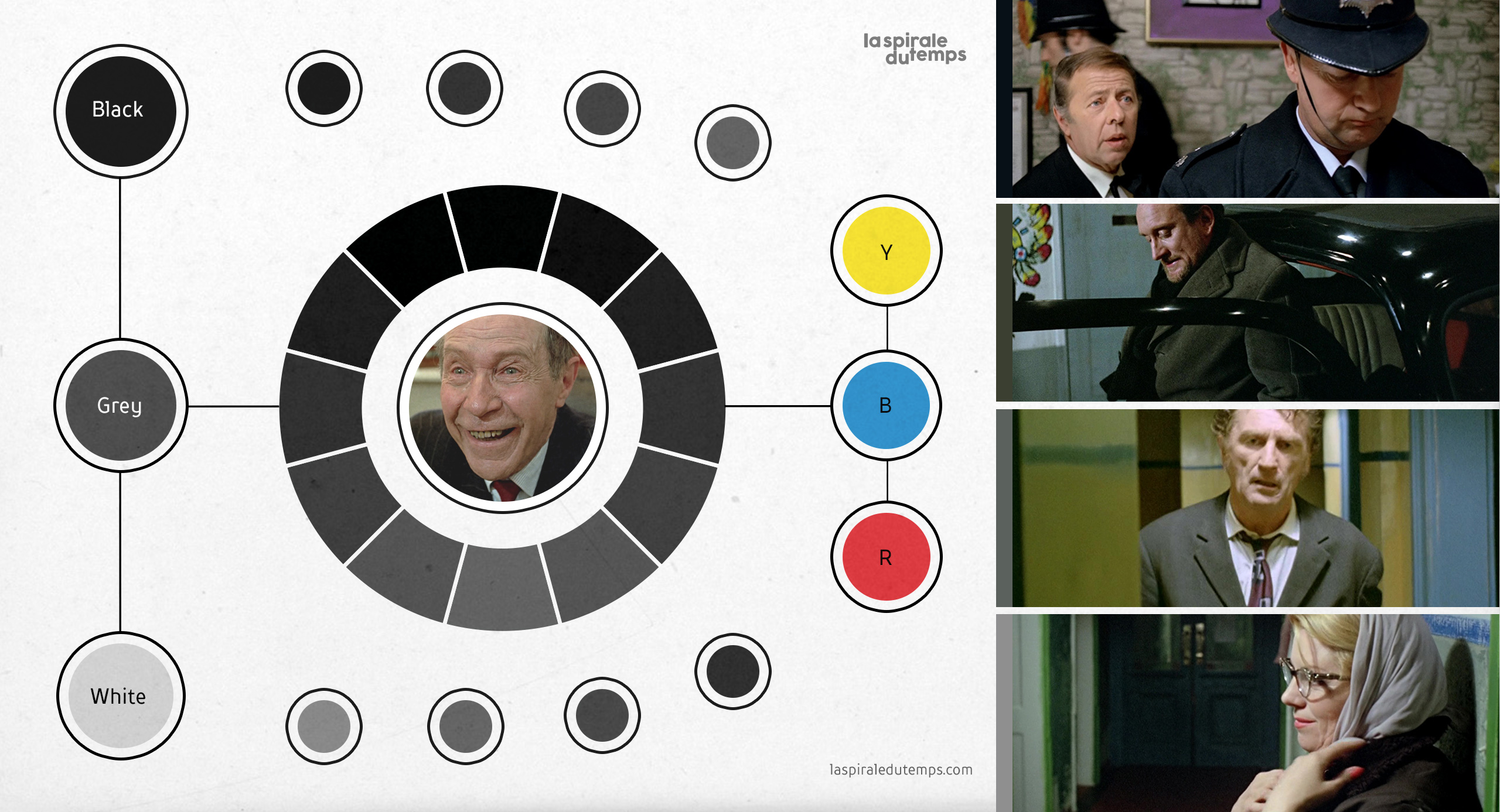
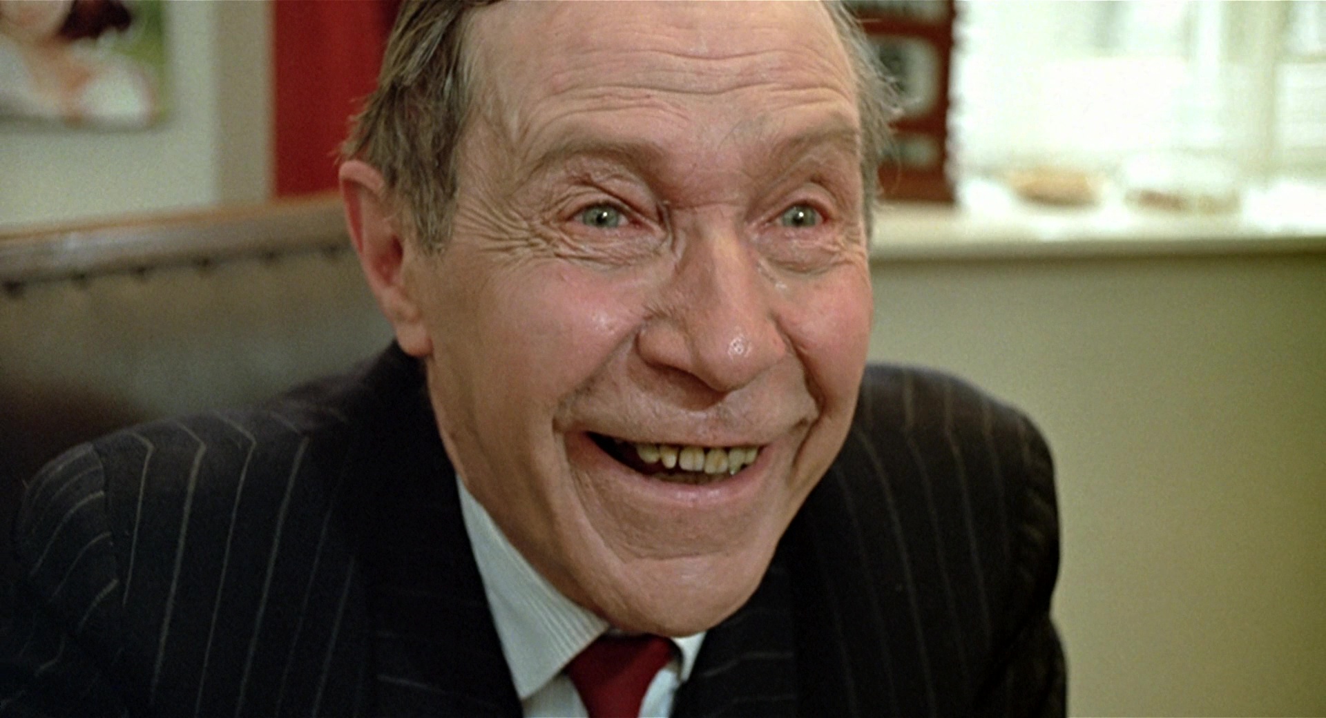
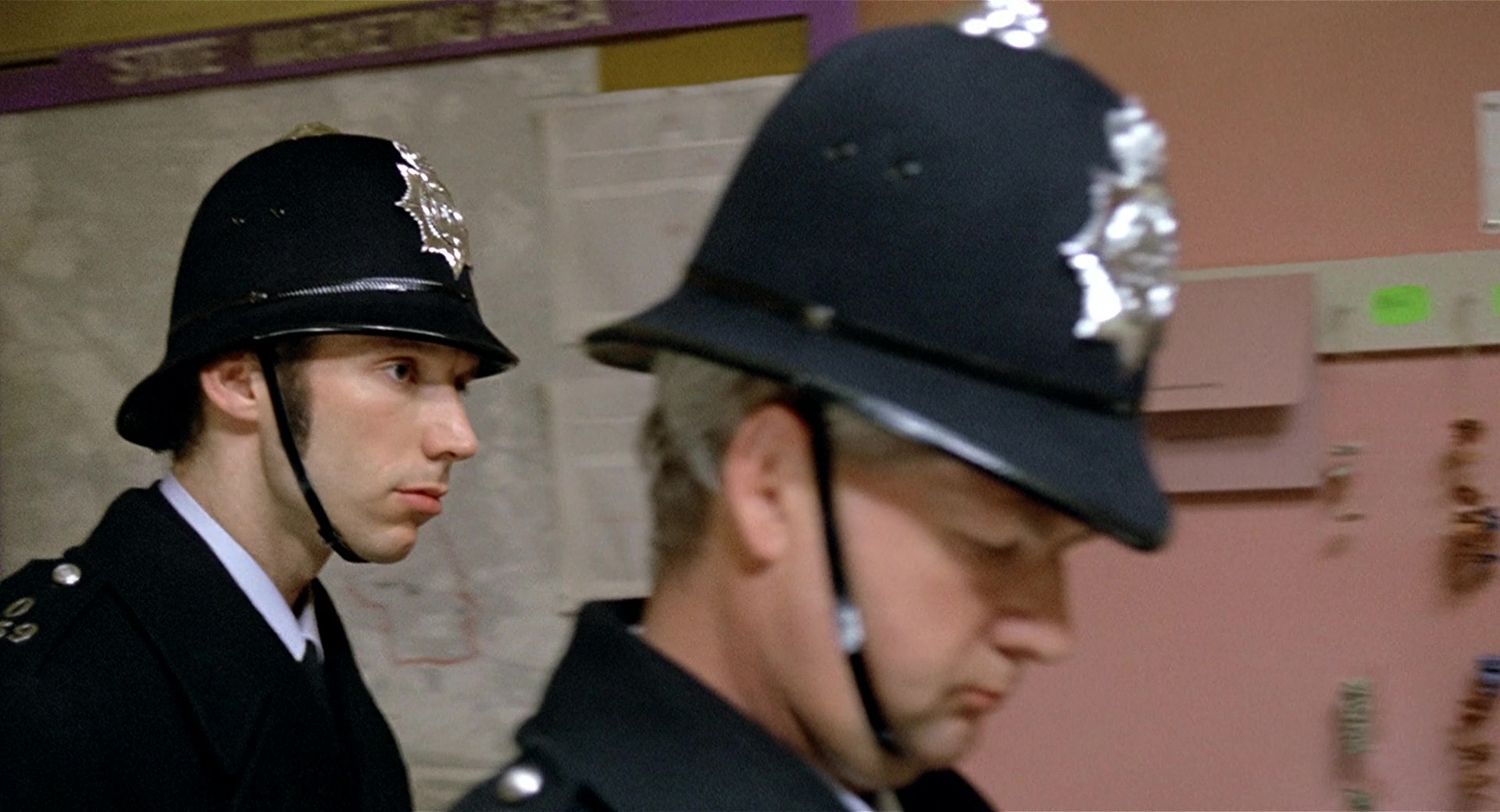
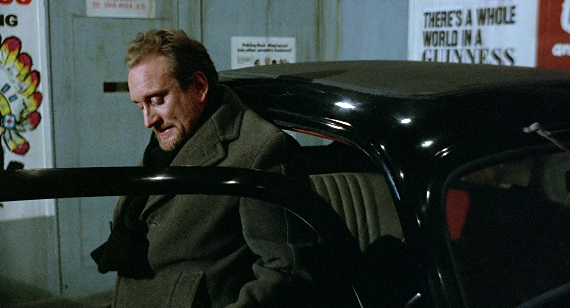
15. Black & Brown
In the case of BLACK, BROWN color and its degrees of value and intensity*, for example, GREY or BEIGE, are associated with mature behaviors or adult people, as we see in Michael’s parents, the teacher, the head of the baths, the maintenance manager, customers or the police.*The three attributes of color are: Color/Hue (the name), Value (the lightness or darkness of a color), and Intensity (the degree of vividness or dullness of a color).
16. Subtractive color mixing
The color scheme that Skolimowski applies in the film is exactly the same pigment used by the painter, where the sum of all material or liquid colors (in the film: the sum of all character’s experience) results in color black (maturity of the character). This phenomenon is called subtractive addition or subtractive mixing/synthesis. Color theory tells us that mixing the three primaries subtracts all color wavelengths, resulting in black. If we had pure pigments of yellow, red and blue spectral primaries, we could easily achieve true black by mixing the three. Combined in equal quantities, cyan, yellow and magenta printing inks yield a beautiful black. But with traditional pigments we can only dull paint to the point of canceling color, never quite reaching black. You will, however, achieve a non-color (Edwards, 2019). Non-color reflected in the film through the Brown and Beige of the clothing worn by adults; brightly colored clothing is usually worn more by teenagers than by adults; this assumption serves us here —using the mixtures of pure black and non-color— to express opposition between discreet and striking colors, between adults and young people. *This scheme is complemented by those on 21st and 26th sections (Part II).